> ## Documentation Index
> Fetch the complete documentation index at: https://docs.ticketspotapp.com/llms.txt
> Use this file to discover all available pages before exploring further.
# Widget colors and fonts reference
> Find every widget color and font control, including checkout, memberships, payment plans, and mobile styles.
Open **Design → Widget**, select your widget, then **All Settings → Design → Customize components**. Search for a setting name to go directly to its section. These controls style this widget; edit shared identity in [Brand](./brand-design).
Choose **Your Brand** for a live connection to the site's colors and font. Local component overrides continue to apply to this widget. A preset theme uses its own palette. Choosing a theme replaces existing design overrides. **Reset** removes component overrides and restores the currently selected theme; it does not switch themes. These changes save immediately, so review the result in the preview. See [Quick Settings](./quick-settings) for the appearance summary.
For colors, open the swatch, choose or enter a hex color, and confirm with the check button; cancel discards the draft. For fonts, open the font picker, choose the family and size, and set bold, italic, or underline. **Apply** saves the draft; **Cancel** leaves the saved font unchanged. **Use default font and style**, followed by Apply, restores the default. A selected brand font follows the site's uploaded font. Mobile typography is separate from desktop typography.
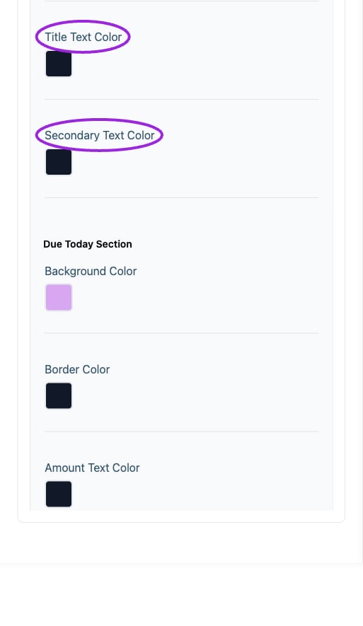
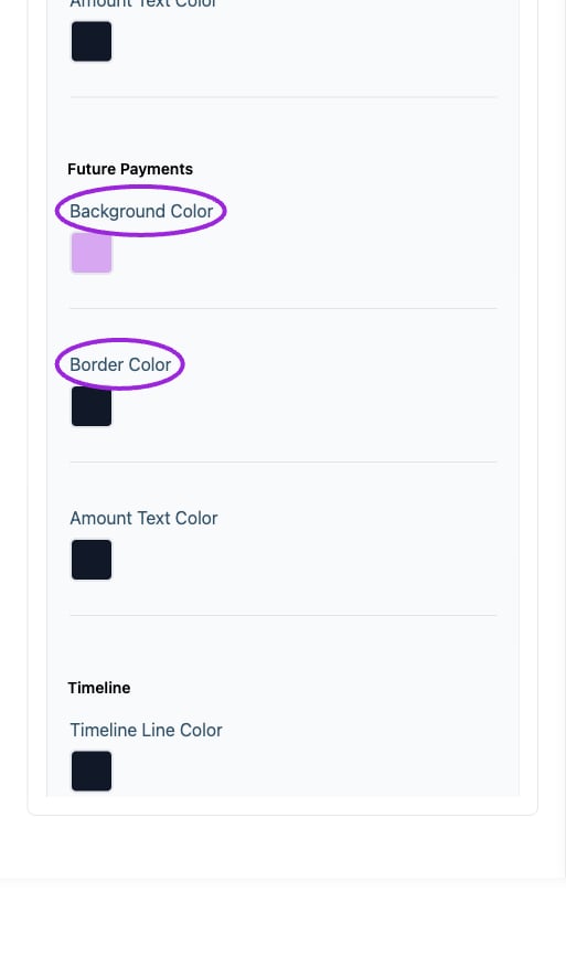
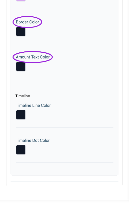
The same element can have both a color row and a font row. Payment plan colors apply separately to Payment Plan Container, Due Today Section, Future Payments, and Timeline. Change one at a time and inspect the preview. Colors and fonts are managed in the **Wix Editor → app Settings → Design** for Wix sites; this dashboard category is hidden there.
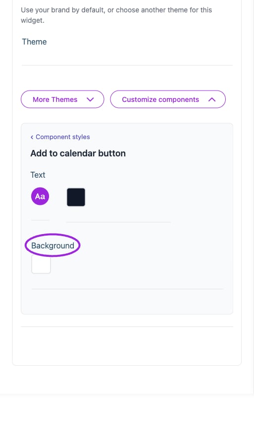
## Add to calendar button
 | Option | Control | What it changes |
| - | - | - |
| **Background** | Color | Set the color of this element; review contrast in the preview. |
| **Text** | Color | Set the color of this element; review contrast in the preview. |
| **Text** | Font and style | Set the font family, size, bold, italic, and underline styling for this text. |
## Attendee details
| Option | Control | What it changes |
| - | - | - |
| **Background** | Color | Set the color of this element; review contrast in the preview. |
| **Text** | Color | Set the color of this element; review contrast in the preview. |
| **Text** | Font and style | Set the font family, size, bold, italic, and underline styling for this text. |
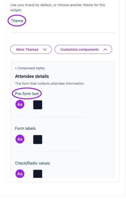
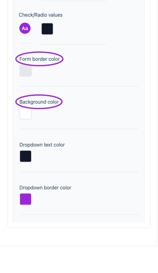
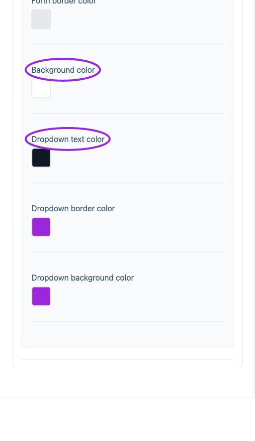
## Attendee details
 | Option | Control | What it changes |
| - | - | - |
| **Background color** | Color | Set the color of this element; review contrast in the preview. |
| **Check/Radio values** | Color | Set the color of this element; review contrast in the preview. |
| **Check/Radio values** | Font and style | Set the font family, size, bold, italic, and underline styling for this text. |
| **Dropdown background color** | Color | Set the color of this element; review contrast in the preview. |
| **Dropdown border color** | Color | Set the color of this element; review contrast in the preview. |
| **Dropdown text color** | Color | Set the color of this element; review contrast in the preview. |
| **Form border color** | Color | Set the color of this element; review contrast in the preview. |
| **Form labels** | Color | Set the color of this element; review contrast in the preview. |
| **Form labels** | Font and style | Set the font family, size, bold, italic, and underline styling for this text. |
| **Pre-form text** | Color | Set the color of this element; review contrast in the preview. |
| **Pre-form text** | Font and style | Set the font family, size, bold, italic, and underline styling for this text. |
## Background & colors
| Option | Control | What it changes |
| - | - | - |
| **Background color** | Color | Set the color of this element; review contrast in the preview. |
| **Check/Radio values** | Color | Set the color of this element; review contrast in the preview. |
| **Check/Radio values** | Font and style | Set the font family, size, bold, italic, and underline styling for this text. |
| **Dropdown background color** | Color | Set the color of this element; review contrast in the preview. |
| **Dropdown border color** | Color | Set the color of this element; review contrast in the preview. |
| **Dropdown text color** | Color | Set the color of this element; review contrast in the preview. |
| **Form border color** | Color | Set the color of this element; review contrast in the preview. |
| **Form labels** | Color | Set the color of this element; review contrast in the preview. |
| **Form labels** | Font and style | Set the font family, size, bold, italic, and underline styling for this text. |
| **Pre-form text** | Color | Set the color of this element; review contrast in the preview. |
| **Pre-form text** | Font and style | Set the font family, size, bold, italic, and underline styling for this text. |
## Background & colors
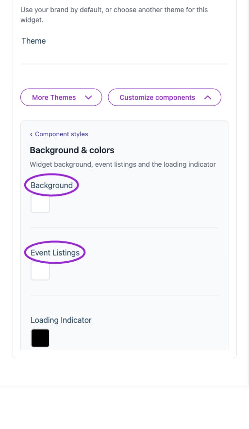 | Option | Control | What it changes |
| - | - | - |
| **Background** | Color | Set the color of this element; review contrast in the preview. |
| **Event Listings** | Color | Set the color of this element; review contrast in the preview. |
| **Loading Indicator** | Color | Set the color of this element; review contrast in the preview. |
## Buttons
| Option | Control | What it changes |
| - | - | - |
| **Background** | Color | Set the color of this element; review contrast in the preview. |
| **Event Listings** | Color | Set the color of this element; review contrast in the preview. |
| **Loading Indicator** | Color | Set the color of this element; review contrast in the preview. |
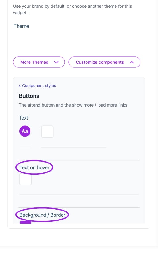
## Buttons
 | Option | Control | What it changes |
| - | - | - |
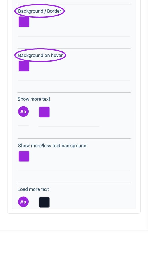
| **Background / Border** | Color | Set the color of this element; review contrast in the preview. |
| **Background on hover** | Color | Set the color of this element; review contrast in the preview. |
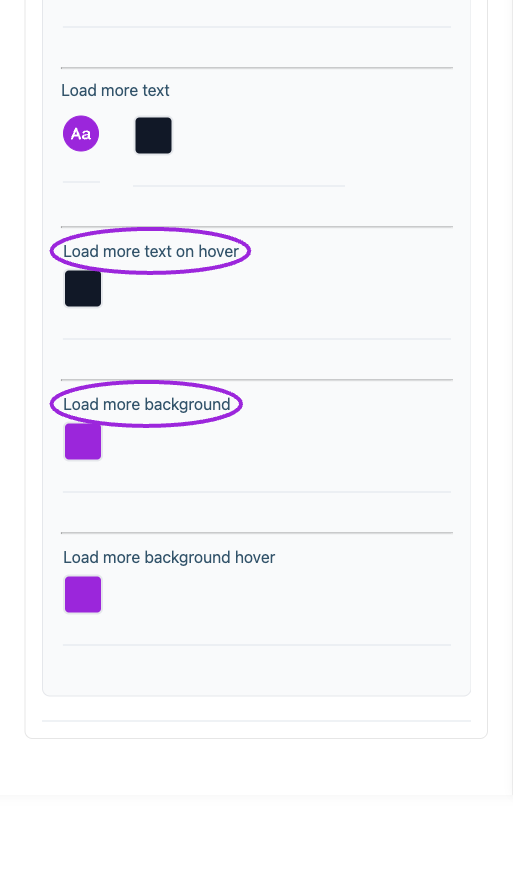
| **Load more background** | Color | Set the color of this element; review contrast in the preview. |
| **Load more background hover** | Color | Set the color of this element; review contrast in the preview. |
| **Load more text** | Color | Set the color of this element; review contrast in the preview. |
| **Load more text** | Font and style | Set the font family, size, bold, italic, and underline styling for this text. |
| **Load more text on hover** | Color | Set the color of this element; review contrast in the preview. |
| **Show more text** | Color | Set the color of this element; review contrast in the preview. |
| **Show more text** | Font and style | Set the font family, size, bold, italic, and underline styling for this text. |
| **Show more/less text background** | Color | Set the color of this element; review contrast in the preview. |
| **Text** | Color | Set the color of this element; review contrast in the preview. |
| **Text** | Font and style | Set the font family, size, bold, italic, and underline styling for this text. |
| **Text on hover** | Color | Set the color of this element; review contrast in the preview. |
## Calendar
| Option | Control | What it changes |
| - | - | - |
| **Background / Border** | Color | Set the color of this element; review contrast in the preview. |
| **Background on hover** | Color | Set the color of this element; review contrast in the preview. |
| **Load more background** | Color | Set the color of this element; review contrast in the preview. |
| **Load more background hover** | Color | Set the color of this element; review contrast in the preview. |
| **Load more text** | Color | Set the color of this element; review contrast in the preview. |
| **Load more text** | Font and style | Set the font family, size, bold, italic, and underline styling for this text. |
| **Load more text on hover** | Color | Set the color of this element; review contrast in the preview. |
| **Show more text** | Color | Set the color of this element; review contrast in the preview. |
| **Show more text** | Font and style | Set the font family, size, bold, italic, and underline styling for this text. |
| **Show more/less text background** | Color | Set the color of this element; review contrast in the preview. |
| **Text** | Color | Set the color of this element; review contrast in the preview. |
| **Text** | Font and style | Set the font family, size, bold, italic, and underline styling for this text. |
| **Text on hover** | Color | Set the color of this element; review contrast in the preview. |
## Calendar
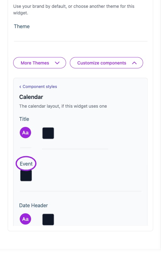
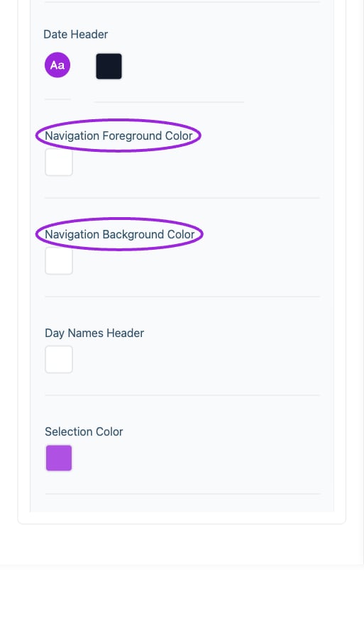
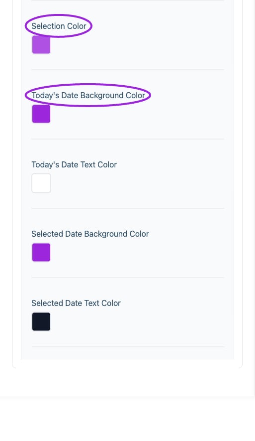
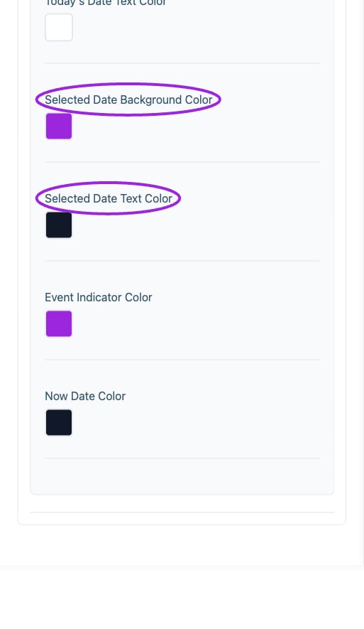 | Option | Control | What it changes |
| - | - | - |
| **Date Header** | Color | Set the color of this element; review contrast in the preview. |
| **Date Header** | Font and style | Set the font family, size, bold, italic, and underline styling for this text. |
| **Day Names Header** | Color | Set the color of this element; review contrast in the preview. |
| **Event** | Color | Set the color of this element; review contrast in the preview. |
| **Event Indicator Color** | Color | Set the color of this element; review contrast in the preview. |
| **Navigation Background Color** | Color | Set the color of this element; review contrast in the preview. |
| **Navigation Foreground Color** | Color | Set the color of this element; review contrast in the preview. |
| **Now Date Color** | Color | Set the color of this element; review contrast in the preview. |
| **Selected Date Background Color** | Color | Set the color of this element; review contrast in the preview. |
| **Selected Date Text Color** | Color | Set the color of this element; review contrast in the preview. |
| **Selection Color** | Color | Set the color of this element; review contrast in the preview. |
| **Title** | Color | Set the color of this element; review contrast in the preview. |
| **Title** | Font and style | Set the font family, size, bold, italic, and underline styling for this text. |
| **Today's Date Background Color** | Color | Set the color of this element; review contrast in the preview. |
| **Today's Date Text Color** | Color | Set the color of this element; review contrast in the preview. |
## Checkout
| Option | Control | What it changes |
| - | - | - |
| **Date Header** | Color | Set the color of this element; review contrast in the preview. |
| **Date Header** | Font and style | Set the font family, size, bold, italic, and underline styling for this text. |
| **Day Names Header** | Color | Set the color of this element; review contrast in the preview. |
| **Event** | Color | Set the color of this element; review contrast in the preview. |
| **Event Indicator Color** | Color | Set the color of this element; review contrast in the preview. |
| **Navigation Background Color** | Color | Set the color of this element; review contrast in the preview. |
| **Navigation Foreground Color** | Color | Set the color of this element; review contrast in the preview. |
| **Now Date Color** | Color | Set the color of this element; review contrast in the preview. |
| **Selected Date Background Color** | Color | Set the color of this element; review contrast in the preview. |
| **Selected Date Text Color** | Color | Set the color of this element; review contrast in the preview. |
| **Selection Color** | Color | Set the color of this element; review contrast in the preview. |
| **Title** | Color | Set the color of this element; review contrast in the preview. |
| **Title** | Font and style | Set the font family, size, bold, italic, and underline styling for this text. |
| **Today's Date Background Color** | Color | Set the color of this element; review contrast in the preview. |
| **Today's Date Text Color** | Color | Set the color of this element; review contrast in the preview. |
## Checkout
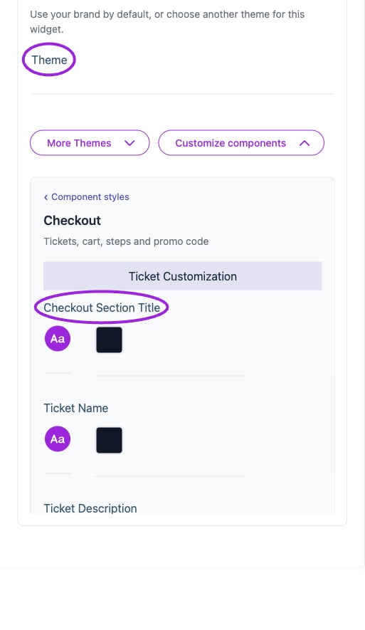
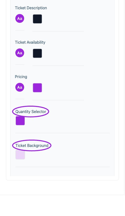
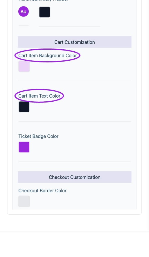
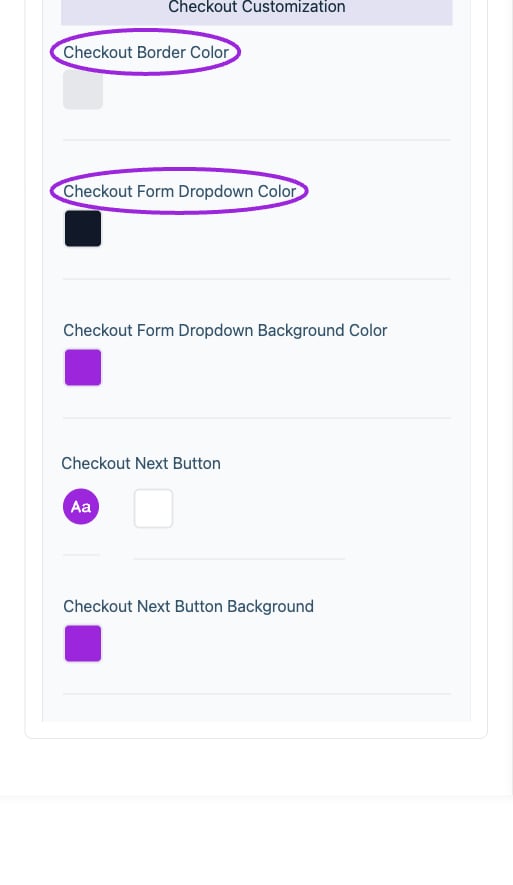
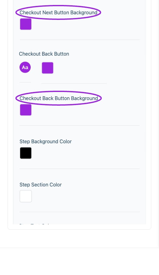
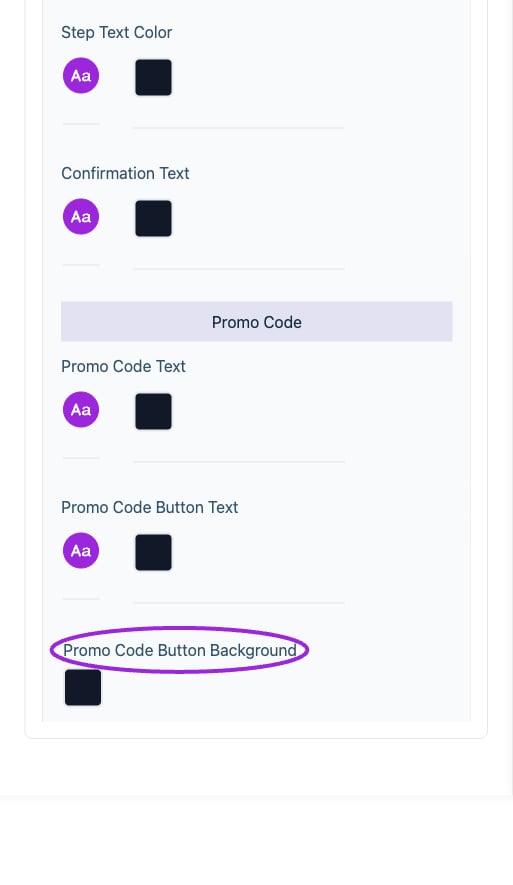 | Option | Control | What it changes |
| - | - | - |
| **Cart Item Background Color** | Color | Set the color of this element; review contrast in the preview. |
| **Cart Item Text Color** | Color | Set the color of this element; review contrast in the preview. |
| **Checkout Back Button** | Color | Set the color of this element; review contrast in the preview. |
| **Checkout Back Button** | Font and style | Set the font family, size, bold, italic, and underline styling for this text. |
| **Checkout Back Button Background** | Color | Set the color of this element; review contrast in the preview. |
| **Checkout Next Button** | Color | Set the color of this element; review contrast in the preview. |
| **Checkout Next Button** | Font and style | Set the font family, size, bold, italic, and underline styling for this text. |
| **Checkout Next Button Background** | Color | Set the color of this element; review contrast in the preview. |
| **Checkout Section Title** | Color | Set the color of this element; review contrast in the preview. |
| **Checkout Section Title** | Font and style | Set the font family, size, bold, italic, and underline styling for this text. |
| **Confirmation Text** | Color | Set the color of this element; review contrast in the preview. |
| **Confirmation Text** | Font and style | Set the font family, size, bold, italic, and underline styling for this text. |
| **Pricing** | Color | Set the color of this element; review contrast in the preview. |
| **Pricing** | Font and style | Set the font family, size, bold, italic, and underline styling for this text. |
| **Promo Code Button Background** | Color | Set the color of this element; review contrast in the preview. |
| **Promo Code Button Text** | Color | Set the color of this element; review contrast in the preview. |
| **Promo Code Button Text** | Font and style | Set the font family, size, bold, italic, and underline styling for this text. |
| **Promo Code Text** | Color | Set the color of this element; review contrast in the preview. |
| **Promo Code Text** | Font and style | Set the font family, size, bold, italic, and underline styling for this text. |
| **Quantity Selector** | Color | Set the color of this element; review contrast in the preview. |
| **Step Background Color** | Color | Set the color of this element; review contrast in the preview. |
| **Step Section Color** | Color | Set the color of this element; review contrast in the preview. |
| **Step Text Color** | Color | Set the color of this element; review contrast in the preview. |
| **Step Text Color** | Font and style | Set the font family, size, bold, italic, and underline styling for this text. |
| **Ticket Availability** | Color | Set the color of this element; review contrast in the preview. |
| **Ticket Availability** | Font and style | Set the font family, size, bold, italic, and underline styling for this text. |
| **Ticket Background** | Color | Set the color of this element; review contrast in the preview. |
| **Ticket Badge Color** | Color | Set the color of this element; review contrast in the preview. |
| **Ticket Description** | Color | Set the color of this element; review contrast in the preview. |
| **Ticket Description** | Font and style | Set the font family, size, bold, italic, and underline styling for this text. |
| **Ticket Name** | Color | Set the color of this element; review contrast in the preview. |
| **Ticket Name** | Font and style | Set the font family, size, bold, italic, and underline styling for this text. |
| **Ticket Summary Header** | Color | Set the color of this element; review contrast in the preview. |
| **Ticket Summary Header** | Font and style | Set the font family, size, bold, italic, and underline styling for this text. |
## Desktop typography
| Option | Control | What it changes |
| - | - | - |
| **Cart Item Background Color** | Color | Set the color of this element; review contrast in the preview. |
| **Cart Item Text Color** | Color | Set the color of this element; review contrast in the preview. |
| **Checkout Back Button** | Color | Set the color of this element; review contrast in the preview. |
| **Checkout Back Button** | Font and style | Set the font family, size, bold, italic, and underline styling for this text. |
| **Checkout Back Button Background** | Color | Set the color of this element; review contrast in the preview. |
| **Checkout Next Button** | Color | Set the color of this element; review contrast in the preview. |
| **Checkout Next Button** | Font and style | Set the font family, size, bold, italic, and underline styling for this text. |
| **Checkout Next Button Background** | Color | Set the color of this element; review contrast in the preview. |
| **Checkout Section Title** | Color | Set the color of this element; review contrast in the preview. |
| **Checkout Section Title** | Font and style | Set the font family, size, bold, italic, and underline styling for this text. |
| **Confirmation Text** | Color | Set the color of this element; review contrast in the preview. |
| **Confirmation Text** | Font and style | Set the font family, size, bold, italic, and underline styling for this text. |
| **Pricing** | Color | Set the color of this element; review contrast in the preview. |
| **Pricing** | Font and style | Set the font family, size, bold, italic, and underline styling for this text. |
| **Promo Code Button Background** | Color | Set the color of this element; review contrast in the preview. |
| **Promo Code Button Text** | Color | Set the color of this element; review contrast in the preview. |
| **Promo Code Button Text** | Font and style | Set the font family, size, bold, italic, and underline styling for this text. |
| **Promo Code Text** | Color | Set the color of this element; review contrast in the preview. |
| **Promo Code Text** | Font and style | Set the font family, size, bold, italic, and underline styling for this text. |
| **Quantity Selector** | Color | Set the color of this element; review contrast in the preview. |
| **Step Background Color** | Color | Set the color of this element; review contrast in the preview. |
| **Step Section Color** | Color | Set the color of this element; review contrast in the preview. |
| **Step Text Color** | Color | Set the color of this element; review contrast in the preview. |
| **Step Text Color** | Font and style | Set the font family, size, bold, italic, and underline styling for this text. |
| **Ticket Availability** | Color | Set the color of this element; review contrast in the preview. |
| **Ticket Availability** | Font and style | Set the font family, size, bold, italic, and underline styling for this text. |
| **Ticket Background** | Color | Set the color of this element; review contrast in the preview. |
| **Ticket Badge Color** | Color | Set the color of this element; review contrast in the preview. |
| **Ticket Description** | Color | Set the color of this element; review contrast in the preview. |
| **Ticket Description** | Font and style | Set the font family, size, bold, italic, and underline styling for this text. |
| **Ticket Name** | Color | Set the color of this element; review contrast in the preview. |
| **Ticket Name** | Font and style | Set the font family, size, bold, italic, and underline styling for this text. |
| **Ticket Summary Header** | Color | Set the color of this element; review contrast in the preview. |
| **Ticket Summary Header** | Font and style | Set the font family, size, bold, italic, and underline styling for this text. |
## Desktop typography
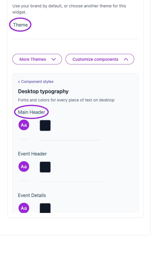
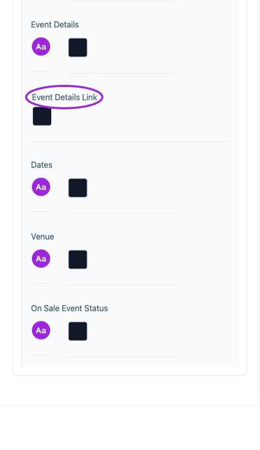
 | Option | Control | What it changes |
| - | - | - |
| **Dates** | Color | Set the color of this element; review contrast in the preview. |
| **Dates** | Font and style | Set the font family, size, bold, italic, and underline styling for this text. |
| **Event Details** | Color | Set the color of this element; review contrast in the preview. |
| **Event Details** | Font and style | Set the font family, size, bold, italic, and underline styling for this text. |
| **Event Details Link** | Color | Set the color of this element; review contrast in the preview. |
| **Event Header** | Color | Set the color of this element; review contrast in the preview. |
| **Event Header** | Font and style | Set the font family, size, bold, italic, and underline styling for this text. |
| **Main Header** | Color | Set the color of this element; review contrast in the preview. |
| **Main Header** | Font and style | Set the font family, size, bold, italic, and underline styling for this text. |
| **Next Event** | Color | Set the color of this element; review contrast in the preview. |
| **Next Event** | Font and style | Set the font family, size, bold, italic, and underline styling for this text. |
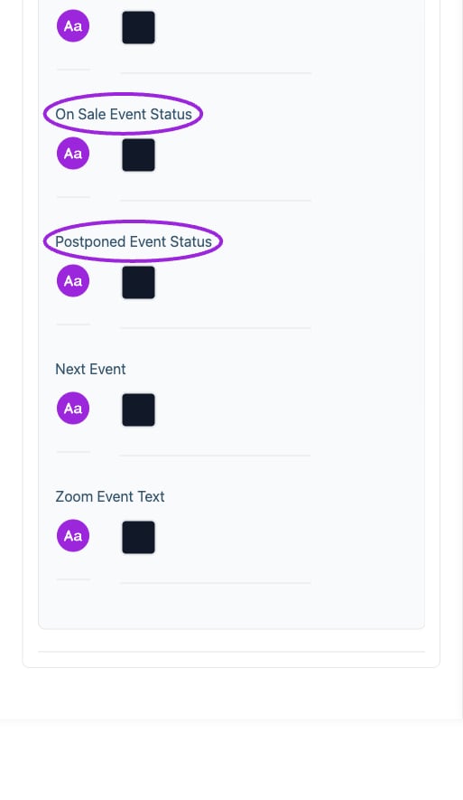
| **On Sale Event Status** | Color | Set the color of this element; review contrast in the preview. |
| **On Sale Event Status** | Font and style | Set the font family, size, bold, italic, and underline styling for this text. |
| **Postponed Event Status** | Color | Set the color of this element; review contrast in the preview. |
| **Postponed Event Status** | Font and style | Set the font family, size, bold, italic, and underline styling for this text. |
| **Venue** | Color | Set the color of this element; review contrast in the preview. |
| **Venue** | Font and style | Set the font family, size, bold, italic, and underline styling for this text. |
| **Zoom Event Text** | Color | Set the color of this element; review contrast in the preview. |
| **Zoom Event Text** | Font and style | Set the font family, size, bold, italic, and underline styling for this text. |
## Memberships
| Option | Control | What it changes |
| - | - | - |
| **Dates** | Color | Set the color of this element; review contrast in the preview. |
| **Dates** | Font and style | Set the font family, size, bold, italic, and underline styling for this text. |
| **Event Details** | Color | Set the color of this element; review contrast in the preview. |
| **Event Details** | Font and style | Set the font family, size, bold, italic, and underline styling for this text. |
| **Event Details Link** | Color | Set the color of this element; review contrast in the preview. |
| **Event Header** | Color | Set the color of this element; review contrast in the preview. |
| **Event Header** | Font and style | Set the font family, size, bold, italic, and underline styling for this text. |
| **Main Header** | Color | Set the color of this element; review contrast in the preview. |
| **Main Header** | Font and style | Set the font family, size, bold, italic, and underline styling for this text. |
| **Next Event** | Color | Set the color of this element; review contrast in the preview. |
| **Next Event** | Font and style | Set the font family, size, bold, italic, and underline styling for this text. |
| **On Sale Event Status** | Color | Set the color of this element; review contrast in the preview. |
| **On Sale Event Status** | Font and style | Set the font family, size, bold, italic, and underline styling for this text. |
| **Postponed Event Status** | Color | Set the color of this element; review contrast in the preview. |
| **Postponed Event Status** | Font and style | Set the font family, size, bold, italic, and underline styling for this text. |
| **Venue** | Color | Set the color of this element; review contrast in the preview. |
| **Venue** | Font and style | Set the font family, size, bold, italic, and underline styling for this text. |
| **Zoom Event Text** | Color | Set the color of this element; review contrast in the preview. |
| **Zoom Event Text** | Font and style | Set the font family, size, bold, italic, and underline styling for this text. |
## Memberships
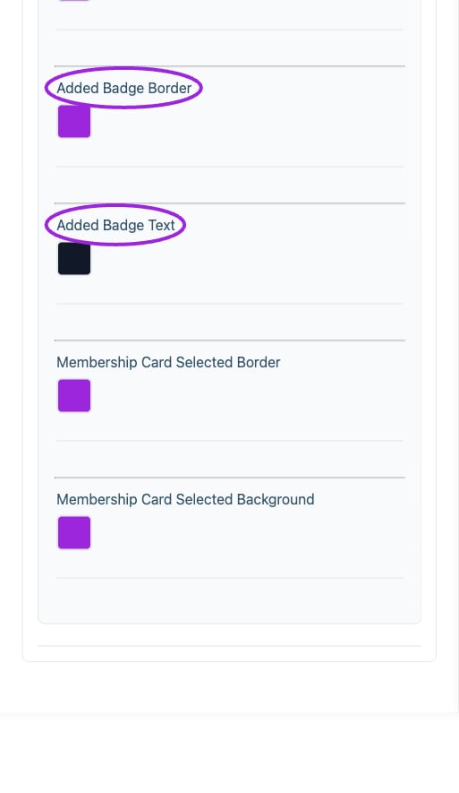 | Option | Control | What it changes |
| - | - | - |
| **Add Button Background** | Color | Set the color of this element; review contrast in the preview. |
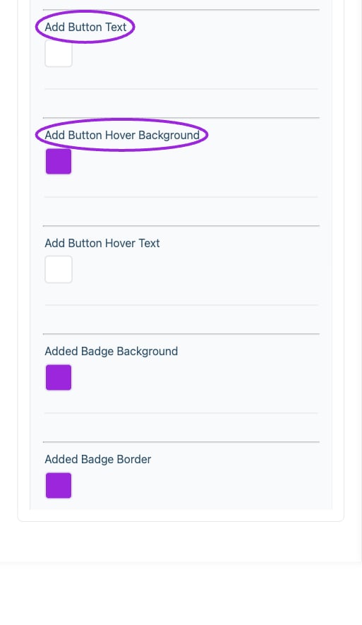
| **Add Button Hover Background** | Color | Set the color of this element; review contrast in the preview. |
| **Add Button Hover Text** | Color | Set the color of this element; review contrast in the preview. |
| **Add Button Text** | Color | Set the color of this element; review contrast in the preview. |
| **Added Badge Background** | Color | Set the color of this element; review contrast in the preview. |
| **Added Badge Border** | Color | Set the color of this element; review contrast in the preview. |
| **Added Badge Text** | Color | Set the color of this element; review contrast in the preview. |
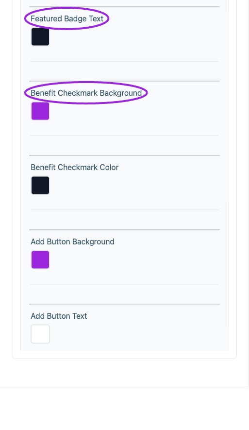
| **Benefit Checkmark Background** | Color | Set the color of this element; review contrast in the preview. |
| **Benefit Checkmark Color** | Color | Set the color of this element; review contrast in the preview. |
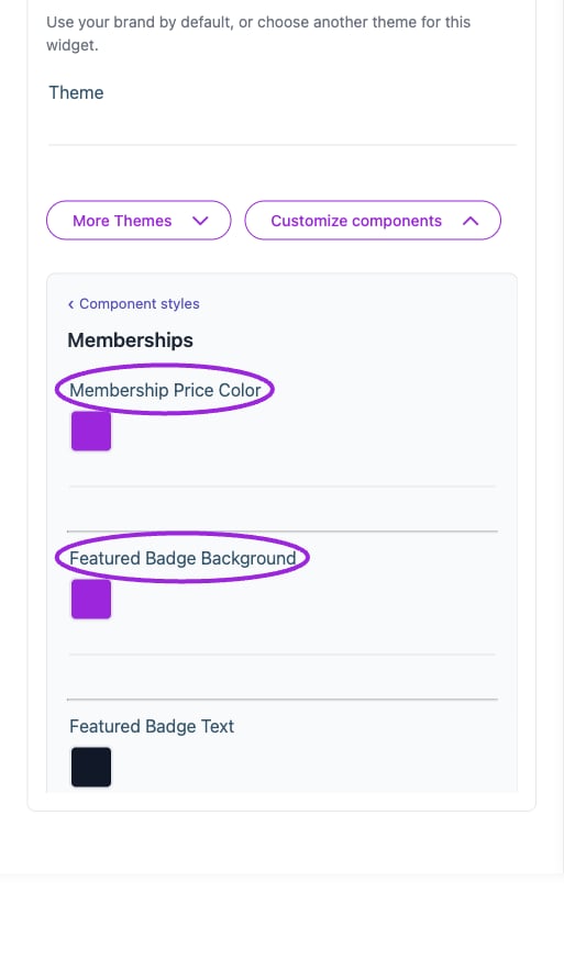
| **Featured Badge Background** | Color | Set the color of this element; review contrast in the preview. |
| **Featured Badge Text** | Color | Set the color of this element; review contrast in the preview. |
| **Membership Card Selected Background** | Color | Set the color of this element; review contrast in the preview. |
| **Membership Card Selected Border** | Color | Set the color of this element; review contrast in the preview. |
| **Membership Price Color** | Color | Set the color of this element; review contrast in the preview. |
## Mobile typography
| Option | Control | What it changes |
| - | - | - |
| **Add Button Background** | Color | Set the color of this element; review contrast in the preview. |
| **Add Button Hover Background** | Color | Set the color of this element; review contrast in the preview. |
| **Add Button Hover Text** | Color | Set the color of this element; review contrast in the preview. |
| **Add Button Text** | Color | Set the color of this element; review contrast in the preview. |
| **Added Badge Background** | Color | Set the color of this element; review contrast in the preview. |
| **Added Badge Border** | Color | Set the color of this element; review contrast in the preview. |
| **Added Badge Text** | Color | Set the color of this element; review contrast in the preview. |
| **Benefit Checkmark Background** | Color | Set the color of this element; review contrast in the preview. |
| **Benefit Checkmark Color** | Color | Set the color of this element; review contrast in the preview. |
| **Featured Badge Background** | Color | Set the color of this element; review contrast in the preview. |
| **Featured Badge Text** | Color | Set the color of this element; review contrast in the preview. |
| **Membership Card Selected Background** | Color | Set the color of this element; review contrast in the preview. |
| **Membership Card Selected Border** | Color | Set the color of this element; review contrast in the preview. |
| **Membership Price Color** | Color | Set the color of this element; review contrast in the preview. |
## Mobile typography
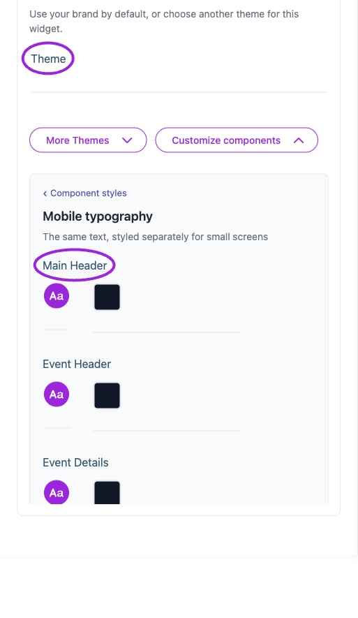
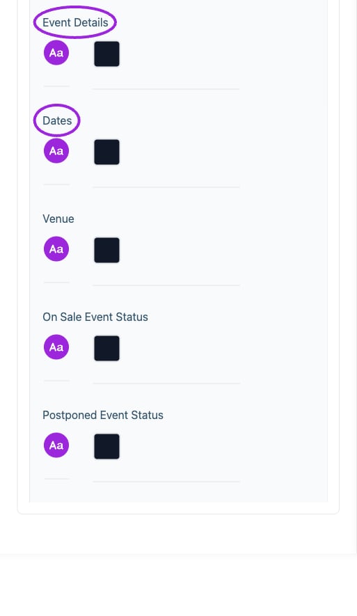
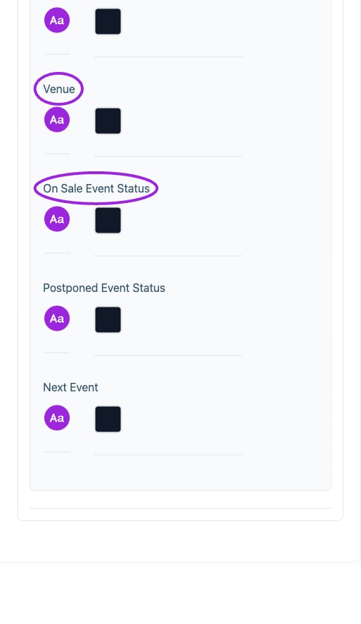 | Option | Control | What it changes |
| - | - | - |
| **Dates** | Color | Set the color of this element; review contrast in the preview. |
| **Dates** | Font and style | Set the font family, size, bold, italic, and underline styling for this text. |
| **Event Details** | Color | Set the color of this element; review contrast in the preview. |
| **Event Details** | Font and style | Set the font family, size, bold, italic, and underline styling for this text. |
| **Event Header** | Color | Set the color of this element; review contrast in the preview. |
| **Event Header** | Font and style | Set the font family, size, bold, italic, and underline styling for this text. |
| **Main Header** | Color | Set the color of this element; review contrast in the preview. |
| **Main Header** | Font and style | Set the font family, size, bold, italic, and underline styling for this text. |
| **Next Event** | Color | Set the color of this element; review contrast in the preview. |
| **Next Event** | Font and style | Set the font family, size, bold, italic, and underline styling for this text. |
| **On Sale Event Status** | Color | Set the color of this element; review contrast in the preview. |
| **On Sale Event Status** | Font and style | Set the font family, size, bold, italic, and underline styling for this text. |
| **Postponed Event Status** | Color | Set the color of this element; review contrast in the preview. |
| **Postponed Event Status** | Font and style | Set the font family, size, bold, italic, and underline styling for this text. |
| **Venue** | Color | Set the color of this element; review contrast in the preview. |
| **Venue** | Font and style | Set the font family, size, bold, italic, and underline styling for this text. |
## Multi-day selection
| Option | Control | What it changes |
| - | - | - |
| **Dates** | Color | Set the color of this element; review contrast in the preview. |
| **Dates** | Font and style | Set the font family, size, bold, italic, and underline styling for this text. |
| **Event Details** | Color | Set the color of this element; review contrast in the preview. |
| **Event Details** | Font and style | Set the font family, size, bold, italic, and underline styling for this text. |
| **Event Header** | Color | Set the color of this element; review contrast in the preview. |
| **Event Header** | Font and style | Set the font family, size, bold, italic, and underline styling for this text. |
| **Main Header** | Color | Set the color of this element; review contrast in the preview. |
| **Main Header** | Font and style | Set the font family, size, bold, italic, and underline styling for this text. |
| **Next Event** | Color | Set the color of this element; review contrast in the preview. |
| **Next Event** | Font and style | Set the font family, size, bold, italic, and underline styling for this text. |
| **On Sale Event Status** | Color | Set the color of this element; review contrast in the preview. |
| **On Sale Event Status** | Font and style | Set the font family, size, bold, italic, and underline styling for this text. |
| **Postponed Event Status** | Color | Set the color of this element; review contrast in the preview. |
| **Postponed Event Status** | Font and style | Set the font family, size, bold, italic, and underline styling for this text. |
| **Venue** | Color | Set the color of this element; review contrast in the preview. |
| **Venue** | Font and style | Set the font family, size, bold, italic, and underline styling for this text. |
## Multi-day selection
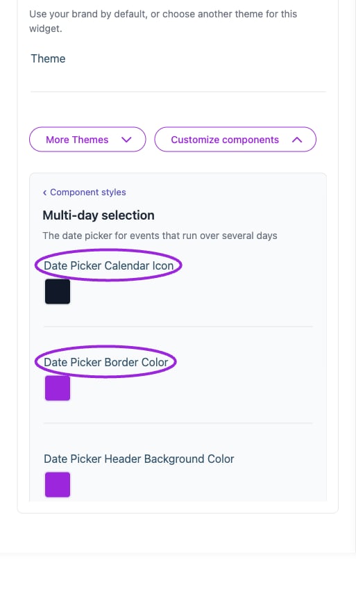
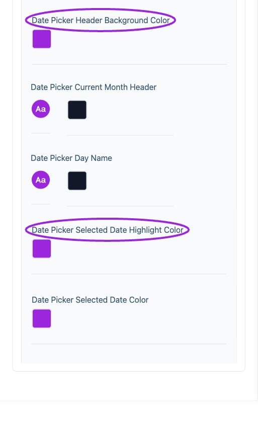
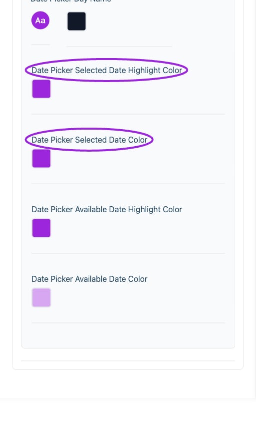 | Option | Control | What it changes |
| - | - | - |
| **Date Picker Available Date Color** | Color | Set the color of this element; review contrast in the preview. |
| **Date Picker Available Date Highlight Color** | Color | Set the color of this element; review contrast in the preview. |
| **Date Picker Border Color** | Color | Set the color of this element; review contrast in the preview. |
| **Date Picker Calendar Icon** | Color | Set the color of this element; review contrast in the preview. |
| **Date Picker Current Month Header** | Color | Set the color of this element; review contrast in the preview. |
| **Date Picker Current Month Header** | Font and style | Set the font family, size, bold, italic, and underline styling for this text. |
| **Date Picker Day Name** | Color | Set the color of this element; review contrast in the preview. |
| **Date Picker Day Name** | Font and style | Set the font family, size, bold, italic, and underline styling for this text. |
| **Date Picker Header Background Color** | Color | Set the color of this element; review contrast in the preview. |
| **Date Picker Selected Date Color** | Color | Set the color of this element; review contrast in the preview. |
| **Date Picker Selected Date Highlight Color** | Color | Set the color of this element; review contrast in the preview. |
## Payment plan
| Option | Control | What it changes |
| - | - | - |
| **Date Picker Available Date Color** | Color | Set the color of this element; review contrast in the preview. |
| **Date Picker Available Date Highlight Color** | Color | Set the color of this element; review contrast in the preview. |
| **Date Picker Border Color** | Color | Set the color of this element; review contrast in the preview. |
| **Date Picker Calendar Icon** | Color | Set the color of this element; review contrast in the preview. |
| **Date Picker Current Month Header** | Color | Set the color of this element; review contrast in the preview. |
| **Date Picker Current Month Header** | Font and style | Set the font family, size, bold, italic, and underline styling for this text. |
| **Date Picker Day Name** | Color | Set the color of this element; review contrast in the preview. |
| **Date Picker Day Name** | Font and style | Set the font family, size, bold, italic, and underline styling for this text. |
| **Date Picker Header Background Color** | Color | Set the color of this element; review contrast in the preview. |
| **Date Picker Selected Date Color** | Color | Set the color of this element; review contrast in the preview. |
| **Date Picker Selected Date Highlight Color** | Color | Set the color of this element; review contrast in the preview. |
## Payment plan
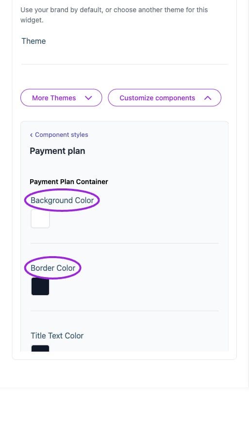
 | Option | Control | What it changes |
| - | - | - |
| **Amount Text Color** | Color | Future Payments: set the amount text color and check contrast. |
| **Amount Text Color** | Color | Due Today Section: set the amount text color and check contrast. |
| **Background Color** | Color | Future Payments: set the background color and check contrast. |
| **Background Color** | Color | Payment Plan Container: set the background color and check contrast. |
| **Background Color** | Color | Due Today Section: set the background color and check contrast. |
| **Border Color** | Color | Future Payments: set the border color and check contrast. |
| **Border Color** | Color | Payment Plan Container: set the border color and check contrast. |
| **Border Color** | Color | Due Today Section: set the border color and check contrast. |
| **Secondary Text Color** | Color | Payment Plan Container: set the secondary text color and check contrast. |
| **Timeline Dot Color** | Color | Timeline: set the timeline dot color and check contrast. |
| **Timeline Line Color** | Color | Timeline: set the timeline line color and check contrast. |
| **Title Text Color** | Color | Payment Plan Container: set the title text color and check contrast. |
## Visitor search & filters
| Option | Control | What it changes |
| - | - | - |
| **Amount Text Color** | Color | Future Payments: set the amount text color and check contrast. |
| **Amount Text Color** | Color | Due Today Section: set the amount text color and check contrast. |
| **Background Color** | Color | Future Payments: set the background color and check contrast. |
| **Background Color** | Color | Payment Plan Container: set the background color and check contrast. |
| **Background Color** | Color | Due Today Section: set the background color and check contrast. |
| **Border Color** | Color | Future Payments: set the border color and check contrast. |
| **Border Color** | Color | Payment Plan Container: set the border color and check contrast. |
| **Border Color** | Color | Due Today Section: set the border color and check contrast. |
| **Secondary Text Color** | Color | Payment Plan Container: set the secondary text color and check contrast. |
| **Timeline Dot Color** | Color | Timeline: set the timeline dot color and check contrast. |
| **Timeline Line Color** | Color | Timeline: set the timeline line color and check contrast. |
| **Title Text Color** | Color | Payment Plan Container: set the title text color and check contrast. |
## Visitor search & filters
 | Option | Control | What it changes |
| - | - | - |
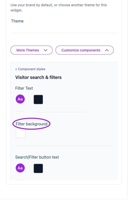
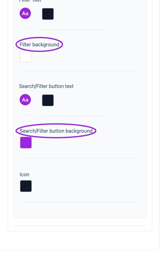
| **Filter background** | Color | Set the color of this element; review contrast in the preview. |
| **Filter Text** | Color | Set the color of this element; review contrast in the preview. |
| **Filter Text** | Font and style | Set the font family, size, bold, italic, and underline styling for this text. |
| **Icon** | Color | Set the color of this element; review contrast in the preview. |
| **Search/Filter button background** | Color | Set the color of this element; review contrast in the preview. |
| **Search/Filter button text** | Color | Set the color of this element; review contrast in the preview. |
| **Search/Filter button text** | Font and style | Set the font family, size, bold, italic, and underline styling for this text. |
## Workshops & add-ons
| Option | Control | What it changes |
| - | - | - |
| **Filter background** | Color | Set the color of this element; review contrast in the preview. |
| **Filter Text** | Color | Set the color of this element; review contrast in the preview. |
| **Filter Text** | Font and style | Set the font family, size, bold, italic, and underline styling for this text. |
| **Icon** | Color | Set the color of this element; review contrast in the preview. |
| **Search/Filter button background** | Color | Set the color of this element; review contrast in the preview. |
| **Search/Filter button text** | Color | Set the color of this element; review contrast in the preview. |
| **Search/Filter button text** | Font and style | Set the font family, size, bold, italic, and underline styling for this text. |
## Workshops & add-ons
 | Option | Control | What it changes |
| - | - | - |
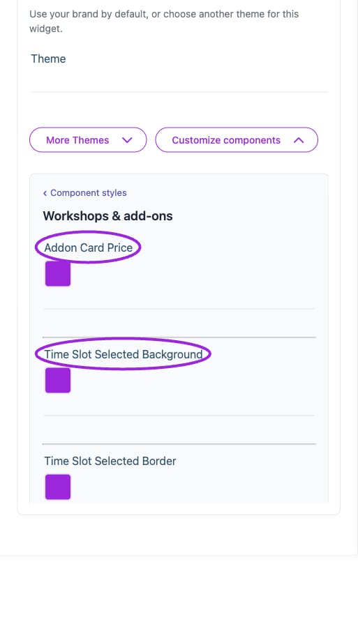
| **Addon Card Price** | Color | Set the color of this element; review contrast in the preview. |
| **Time Slot Selected Background** | Color | Set the color of this element; review contrast in the preview. |
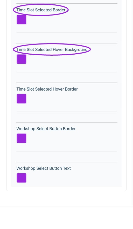
| **Time Slot Selected Border** | Color | Set the color of this element; review contrast in the preview. |
| **Time Slot Selected Hover Background** | Color | Set the color of this element; review contrast in the preview. |
| **Time Slot Selected Hover Border** | Color | Set the color of this element; review contrast in the preview. |
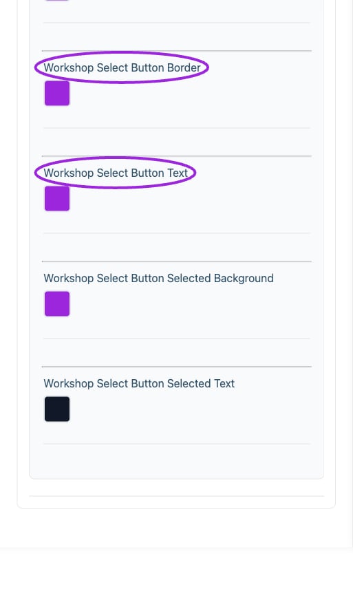
| **Workshop Select Button Border** | Color | Set the color of this element; review contrast in the preview. |
| **Workshop Select Button Selected Background** | Color | Set the color of this element; review contrast in the preview. |
| **Workshop Select Button Selected Text** | Color | Set the color of this element; review contrast in the preview. |
| **Workshop Select Button Text** | Color | Set the color of this element; review contrast in the preview. |
## Save and verify
Wait for the setting update to finish, check the preview, and open the installed widget to confirm the result. If a control is unavailable, review its prerequisite, site type, and plan. [Return to widget setup](./widget-customization-overview).
This documentation is built and hosted on [Mintlify](https://mintlify.com), a developer documentation platform.
| Option | Control | What it changes |
| - | - | - |
| **Addon Card Price** | Color | Set the color of this element; review contrast in the preview. |
| **Time Slot Selected Background** | Color | Set the color of this element; review contrast in the preview. |
| **Time Slot Selected Border** | Color | Set the color of this element; review contrast in the preview. |
| **Time Slot Selected Hover Background** | Color | Set the color of this element; review contrast in the preview. |
| **Time Slot Selected Hover Border** | Color | Set the color of this element; review contrast in the preview. |
| **Workshop Select Button Border** | Color | Set the color of this element; review contrast in the preview. |
| **Workshop Select Button Selected Background** | Color | Set the color of this element; review contrast in the preview. |
| **Workshop Select Button Selected Text** | Color | Set the color of this element; review contrast in the preview. |
| **Workshop Select Button Text** | Color | Set the color of this element; review contrast in the preview. |
## Save and verify
Wait for the setting update to finish, check the preview, and open the installed widget to confirm the result. If a control is unavailable, review its prerequisite, site type, and plan. [Return to widget setup](./widget-customization-overview).
This documentation is built and hosted on [Mintlify](https://mintlify.com), a developer documentation platform.