Open Design → Widget, then choose the widget in Editing Widget. Quick Settings provides the most frequently used controls. Changes here update the same settings found under All Settings.
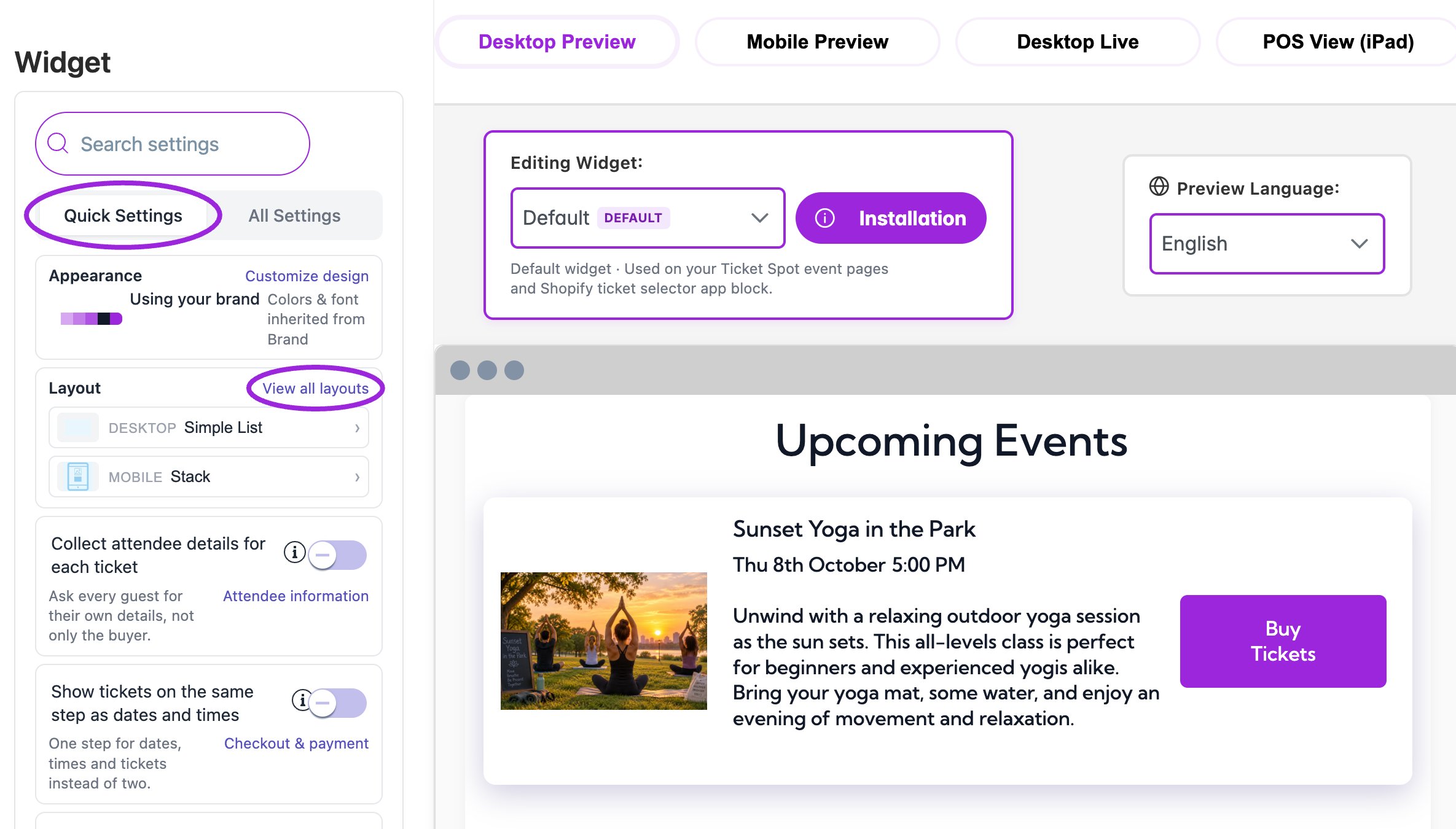
Design → Widget starts with Quick Settings beside the live event preview.

Design → Widget starts with Quick Settings beside the live event preview.

Quick Settings controls
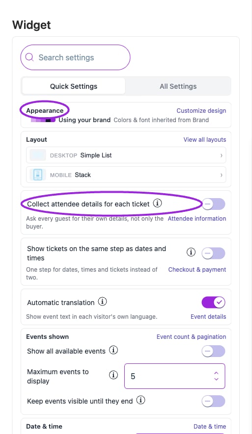
Quick Settings groups common layout, checkout, language, event-count, date, and button controls. Use each card’s link to open its full settings section.

Quick Settings groups common layout, checkout, language, event-count, date, and button controls. Use each card’s link to open its full settings section.

Find any setting
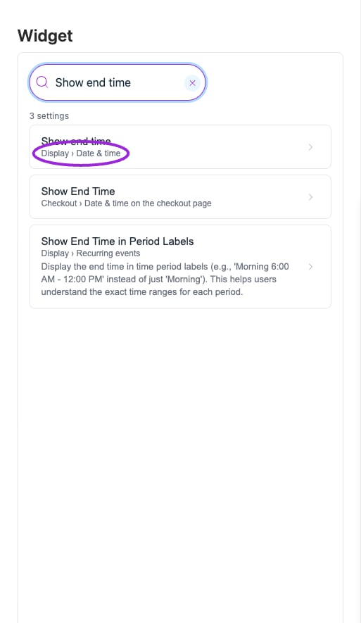
Search results include the category and section, so similarly named widget and checkout controls can be distinguished.

Search results include the category and section, so similarly named widget and checkout controls can be distinguished.

  1. Enter a term in Search settings, such as “attendee”, “seating”, “font”, “required ticket”, or “time”.
  2. Select the result. Its category and section identify where the control belongs.
  3. Follow any prerequisite shown for the setting. Some controls depend on another toggle, a specific layout, site type, or plan.
  4. Use the breadcrumb to move to the parent section, All Settings, or Back to results.
  5. Clear the search to return to the settings navigation.
Search finds controls; it does not enable their prerequisites or change their values.
Settings search for Show end time opens Display → Date & time and highlights the matching control.

Search for a setting, identify its category, and open the result to jump to the control. This demonstration does not change the setting.

Appearance and saving
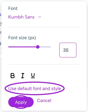
Font changes are drafts until you choose Apply. Cancel closes the editor without applying the draft; Use default font and style resets the draft to its default values.

Font changes are drafts until you choose Apply. Cancel closes the editor without applying the draft; Use default font and style resets the draft to its default values.

Using your brand means the widget follows later Brand changes. A custom-change count identifies local overrides. A named preset with Pre-designed theme uses that theme instead. Choose Your Brand in Design to use the shared brand again. Most widget settings save and publish when changed. Color-picker drafts need confirmation; font edits have an explicit Apply action. Wait for updates to finish, check the preview, then open the installed widget on desktop and mobile. Continue with widget setup, display options, and colors and fonts. See the language and locale setup guide and language FAQ for automatic widget translation, preview language, communication defaults, and per-language overrides.
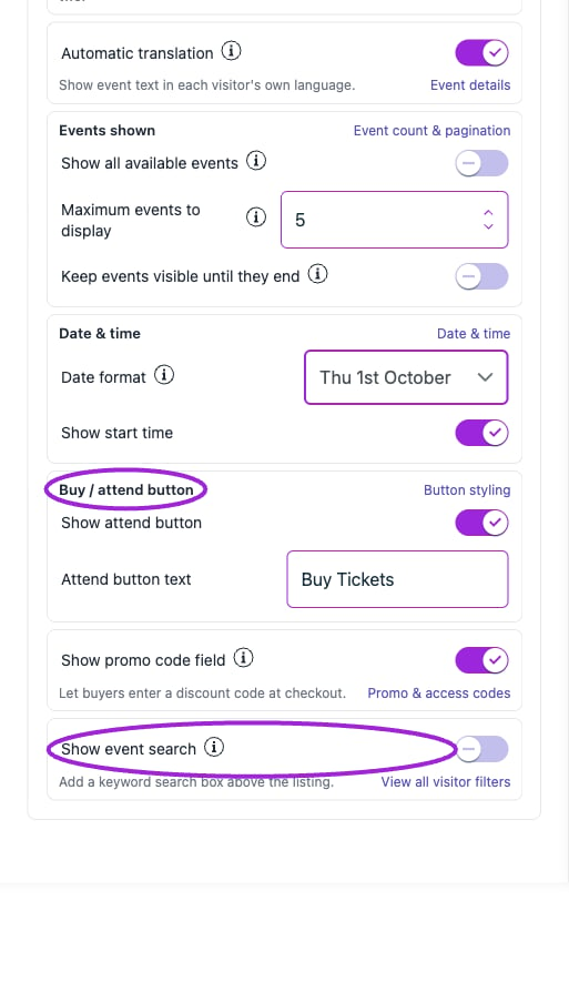
Lower Quick Settings cards include date/time, the attend button, promo-code entry, and event search. Their links open the related full settings.

Lower Quick Settings cards include date/time, the attend button, promo-code entry, and event search. Their links open the related full settings.