
Add to calendar button
View current controls
View current controls
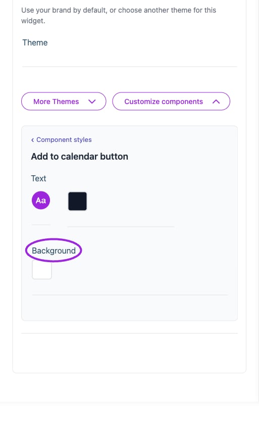
All Settings → Add to calendar button — Buttons and add-to-calendar styling. The circles identify Background.
Attendee details
View current controls
View current controls
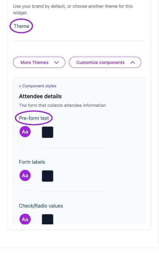
All Settings → Attendee details — Checkout and attendee form styling. The circles identify Theme and Pre-form text.
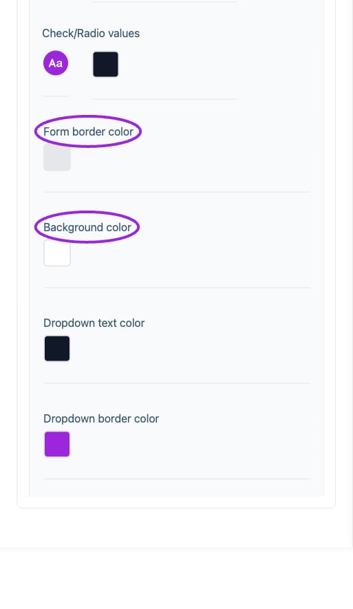
All Settings → Attendee details — Checkout and attendee form styling. Continued controls. The circles identify Form border color and Background color.
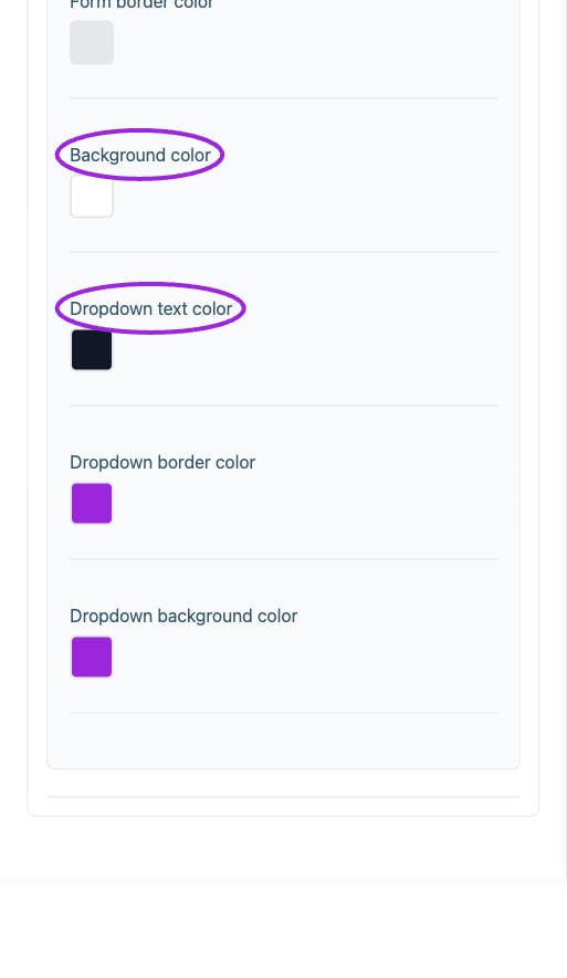
All Settings → Attendee details — Checkout and attendee form styling. Continued controls. The circles identify Background color and Dropdown text color.
Background & colors
View current controls
View current controls
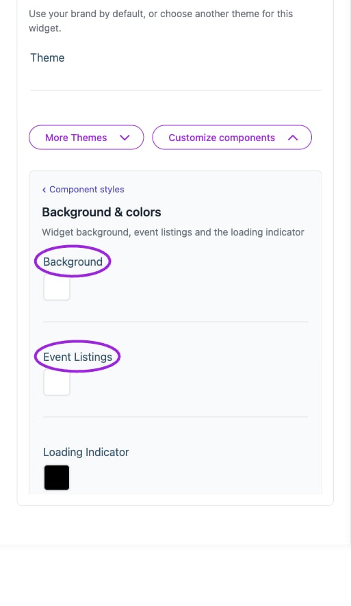
All Settings → Background & colors — Change component styling and inspect preview. The circles identify Background and Event Listings.
Buttons
View current controls
View current controls
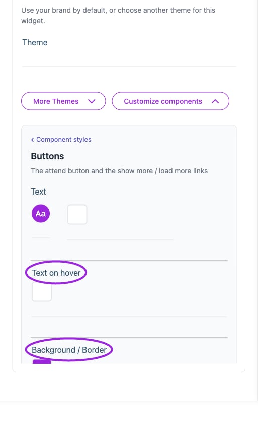
All Settings → Buttons — Buttons and add-to-calendar styling. The circles identify Text on hover and Background / Border.
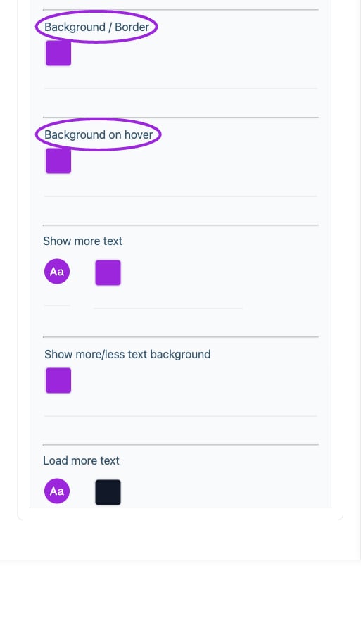
All Settings → Buttons — Buttons and add-to-calendar styling. Continued controls. The circles identify Background / Border and Background on hover.
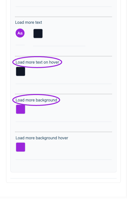
All Settings → Buttons — Buttons and add-to-calendar styling. Continued controls. The circles identify Load more text on hover and Load more background.
Calendar
View current controls
View current controls
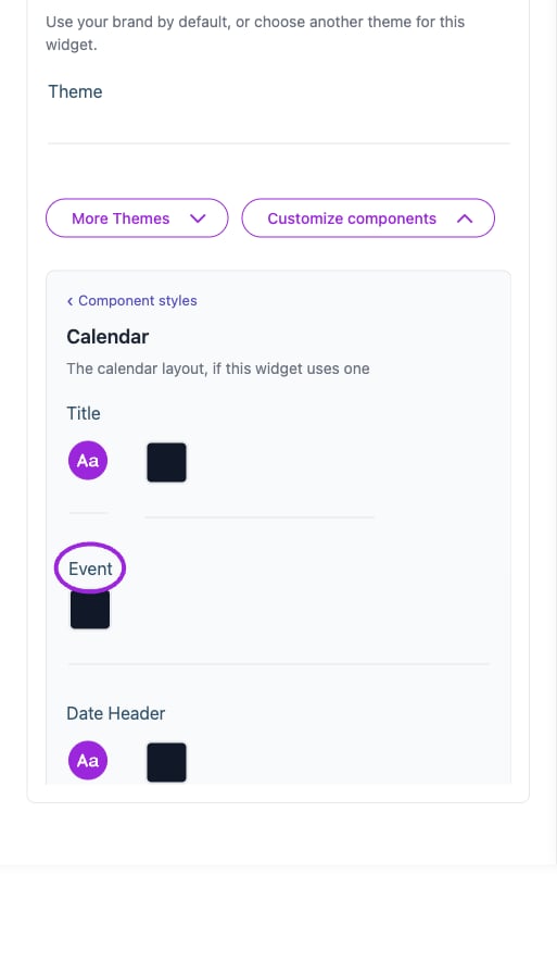
All Settings → Calendar — Calendar and multi-day styling. The circles identify Event.
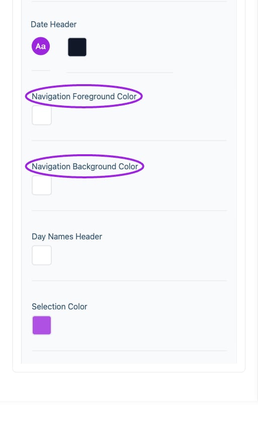
All Settings → Calendar — Calendar and multi-day styling. Continued controls. The circles identify Navigation Foreground Color and Navigation Background Color.
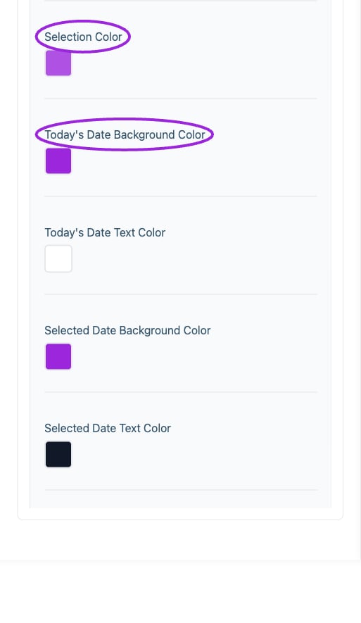
All Settings → Calendar — Calendar and multi-day styling. Continued controls. The circles identify Selection Color and Today's Date Background Color.
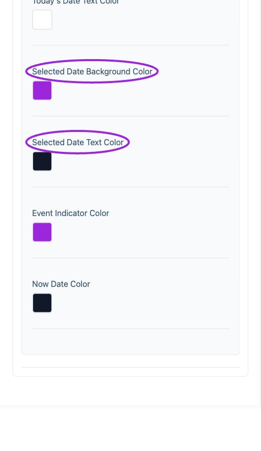
All Settings → Calendar — Calendar and multi-day styling. Continued controls. The circles identify Selected Date Background Color and Selected Date Text Color.
Checkout
View current controls
View current controls
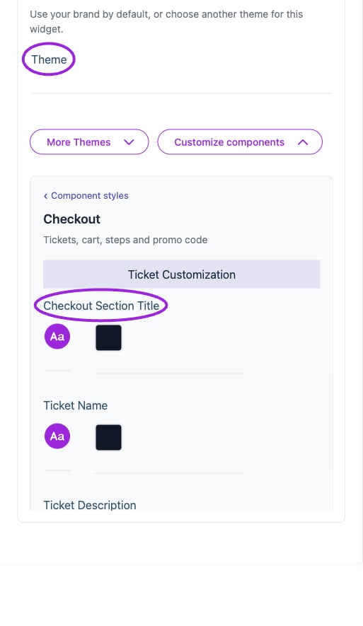
All Settings → Checkout — Checkout and attendee form styling. The circles identify Theme and Checkout Section Title.
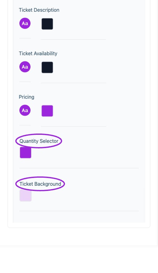
All Settings → Checkout — Checkout and attendee form styling. Continued controls. The circles identify Quantity Selector and Ticket Background.
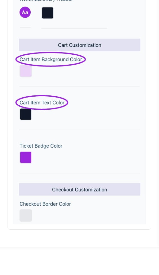
All Settings → Checkout — Checkout and attendee form styling. Continued controls. The circles identify Cart Item Background Color and Cart Item Text Color.
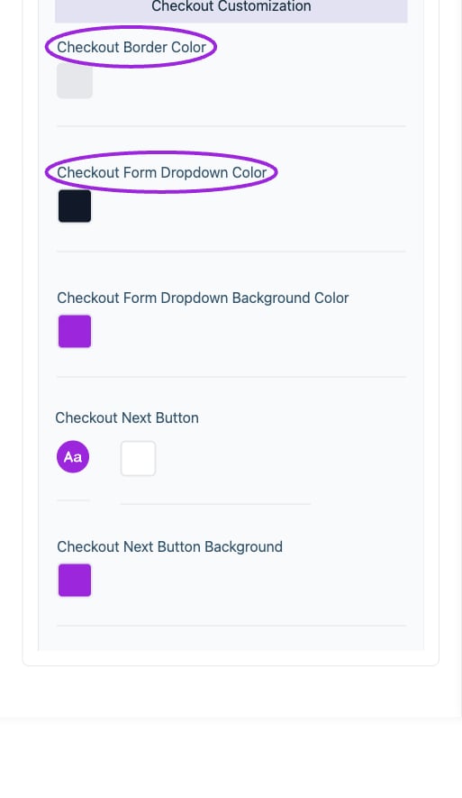
All Settings → Checkout — Checkout and attendee form styling. Continued controls. The circles identify Checkout Border Color and Checkout Form Dropdown Color.
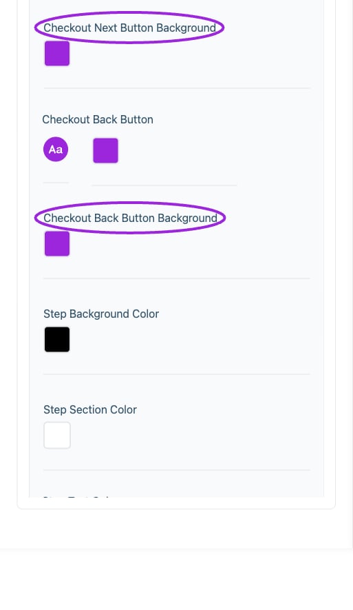
All Settings → Checkout — Checkout and attendee form styling. Continued controls. The circles identify Checkout Next Button Background and Checkout Back Button Background.
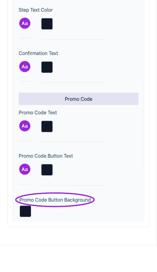
All Settings → Checkout — Checkout and attendee form styling. Continued controls. The circles identify Promo Code Button Background.
Desktop typography
View current controls
View current controls
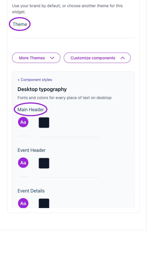
All Settings → Desktop typography — Desktop and mobile typography controls. The circles identify Theme and Main Header.
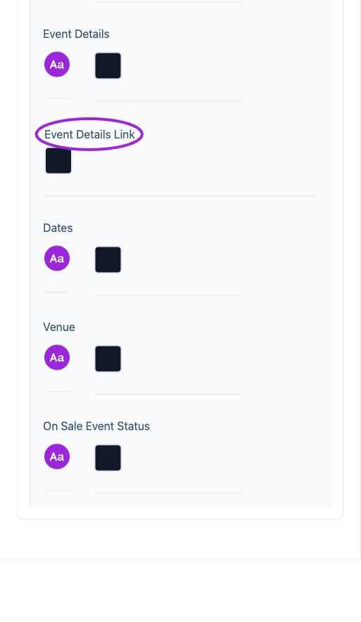
All Settings → Desktop typography — Desktop and mobile typography controls. Continued controls. The circles identify Event Details Link.
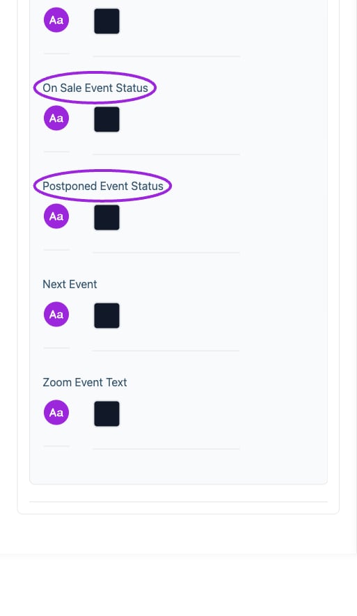
All Settings → Desktop typography — Desktop and mobile typography controls. Continued controls. The circles identify On Sale Event Status and Postponed Event Status.
Memberships
View current controls
View current controls
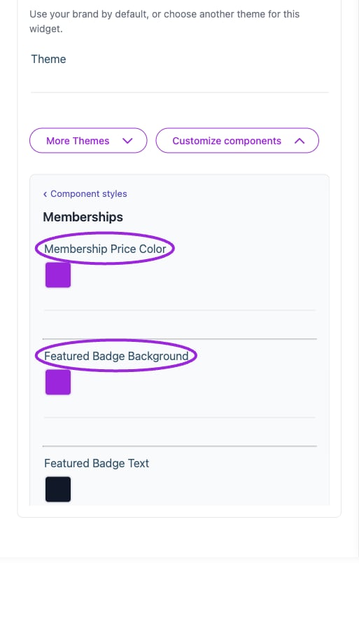
All Settings → Memberships — Membership card styling. The circles identify Membership Price Color and Featured Badge Background.
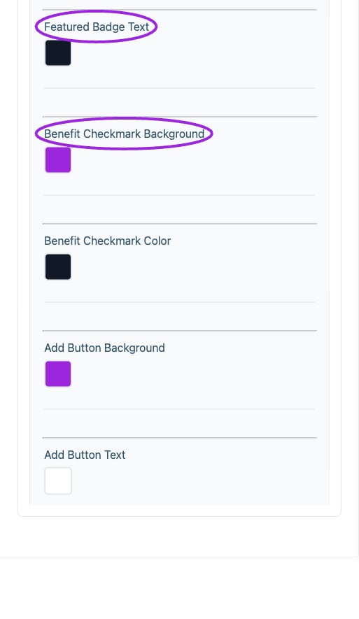
All Settings → Memberships — Membership card styling. Continued controls. The circles identify Featured Badge Text and Benefit Checkmark Background.
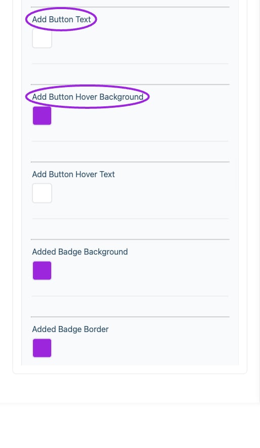
All Settings → Memberships — Membership card styling. Continued controls. The circles identify Add Button Text and Add Button Hover Background.
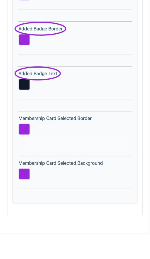
All Settings → Memberships — Membership card styling. Continued controls. The circles identify Added Badge Border and Added Badge Text.
Mobile typography
View current controls
View current controls
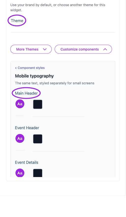
All Settings → Mobile typography — Desktop and mobile typography controls. The circles identify Theme and Main Header.
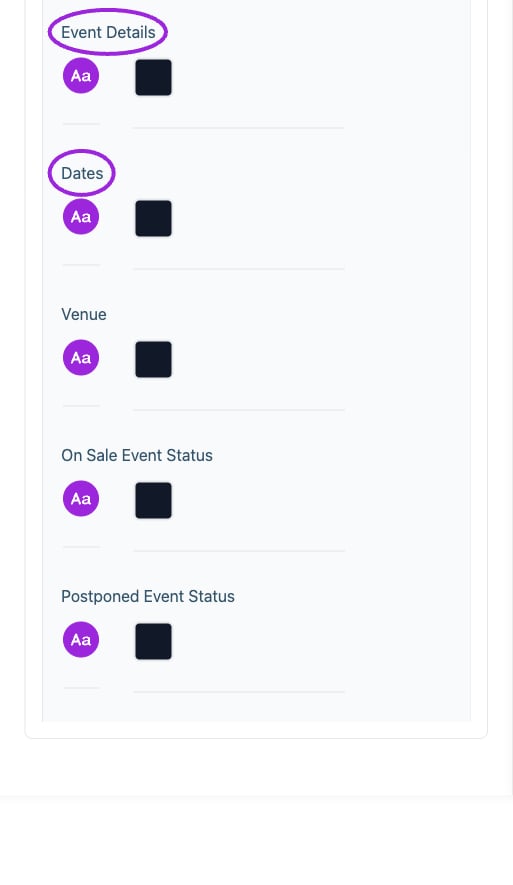
All Settings → Mobile typography — Desktop and mobile typography controls. Continued controls. The circles identify Event Details and Dates.
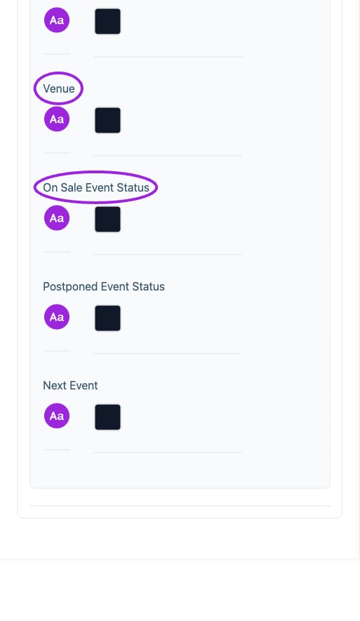
All Settings → Mobile typography — Desktop and mobile typography controls. Continued controls. The circles identify Venue and On Sale Event Status.
Multi-day selection
View current controls
View current controls
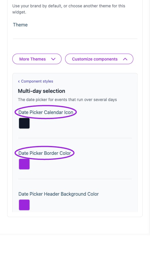
All Settings → Multi-day selection — Calendar and multi-day styling. The circles identify Date Picker Calendar Icon and Date Picker Border Color.
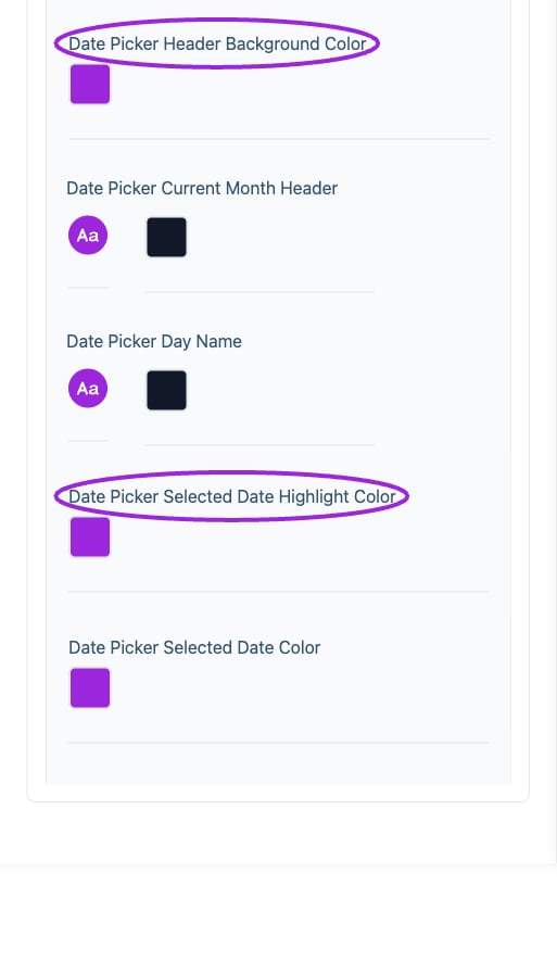
All Settings → Multi-day selection — Calendar and multi-day styling. Continued controls. The circles identify Date Picker Header Background Color and Date Picker Selected Date Highlight Color.
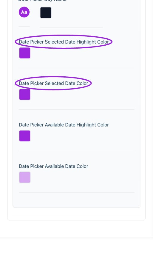
All Settings → Multi-day selection — Calendar and multi-day styling. Continued controls. The circles identify Date Picker Selected Date Highlight Color and Date Picker Selected Date Color.
Payment plan
View current controls
View current controls
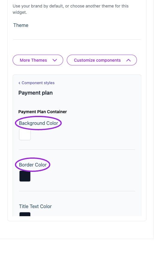
All Settings → Payment plan — Payment-plan component styling. The circles identify Background Color and Border Color.
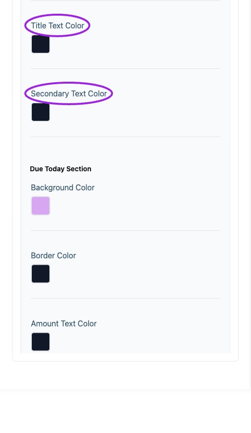
All Settings → Payment plan — Payment-plan component styling. Continued controls. The circles identify Title Text Color and Secondary Text Color.
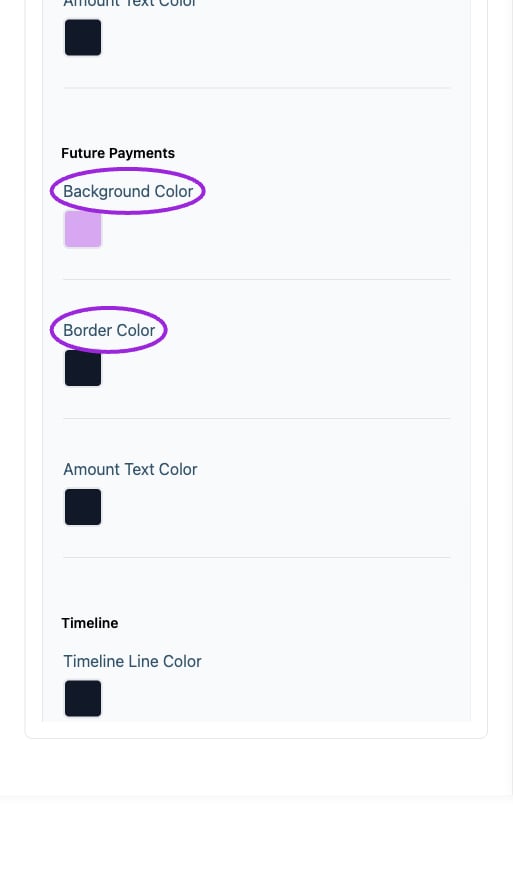
All Settings → Payment plan — Payment-plan component styling. Continued controls. The circles identify Background Color and Border Color.
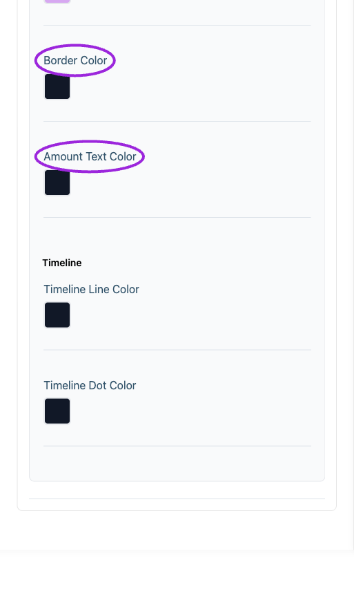
All Settings → Payment plan — Payment-plan component styling. Continued controls. The circles identify Border Color and Amount Text Color.
Visitor search & filters
View current controls
View current controls
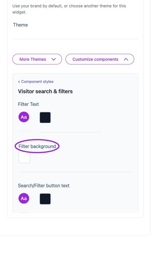
All Settings → Visitor search & filters — Visitor filter styling. The circles identify Filter background.
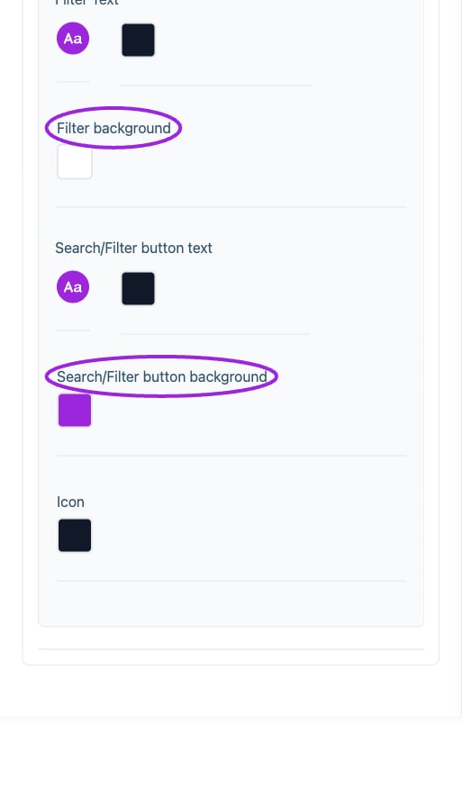
All Settings → Visitor search & filters — Visitor filter styling. Continued controls. The circles identify Filter background and Search/Filter button background.
Workshops & add-ons
View current controls
View current controls
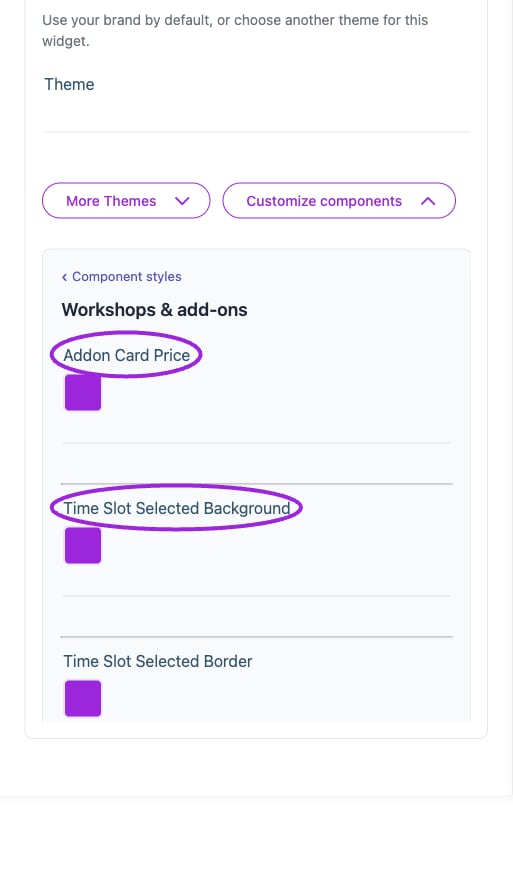
All Settings → Workshops & add-ons — Workshop and add-on styling. The circles identify Addon Card Price and Time Slot Selected Background.
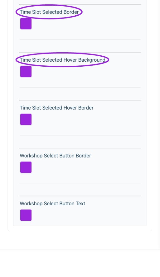
All Settings → Workshops & add-ons — Workshop and add-on styling. Continued controls. The circles identify Time Slot Selected Border and Time Slot Selected Hover Background.
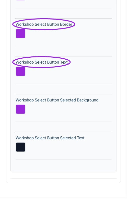
All Settings → Workshops & add-ons — Workshop and add-on styling. Continued controls. The circles identify Workshop Select Button Border and Workshop Select Button Text.