
{ticket}, {quantity}, {count}, {step}, {completed}, {total}, {remaining}, {price}, and {duration} in messages that need those values. Installment fields may use double braces such as {{amount}} and {{count}}. These examples are shown as placeholders in the reference tables below.
Automatic translation changes supported event text to the visitor’s language; the search-filter translation control depends on it. Outgoing emails and tickets have separate Multilingual communications settings. Shopify variant labels apply to the Shopify product experience.
New checkout wording includes per-attendee progress, copy-from-purchaser and save/next actions, review/order errors, waitlist details, required-ticket guidance, seat-limit/unavailable messages, add-on quantities and conflicts, and membership verification/pricing. Test the corresponding states after changing their wording; a normal purchase will not exercise error and sold-out messages.
Checkout › Add-ons
View current controls
View current controls
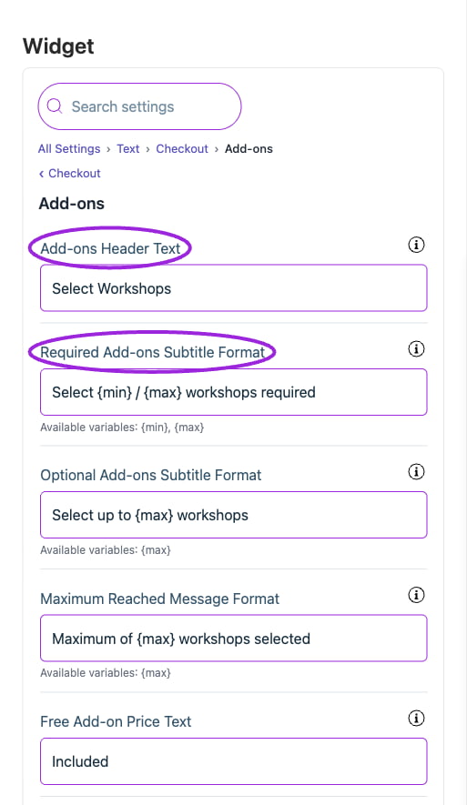
All Settings → Text — Checkout: Add-ons. The circles identify Add-ons Header Text and Required Add-ons Subtitle Format.
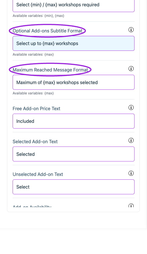
All Settings → Text — Checkout: Add-ons. Continued controls. The circles identify Optional Add-ons Subtitle Format and Maximum Reached Message Format.
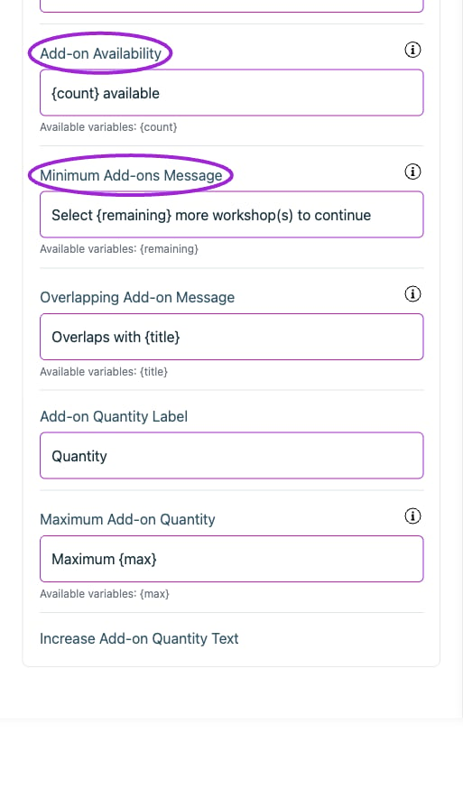
All Settings → Text — Checkout: Add-ons. Continued controls. The circles identify Add-on Availability and Minimum Add-ons Message.
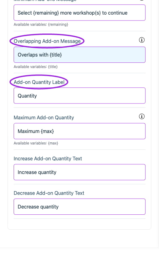
All Settings → Text — Checkout: Add-ons. Continued controls. The circles identify Overlapping Add-on Message and Add-on Quantity Label.
Checkout › Attendee information
View current controls
View current controls
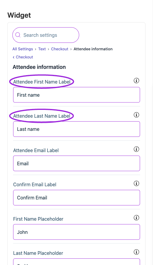
All Settings → Text — Checkout: Attendee information. The circles identify Attendee First Name Label and Attendee Last Name Label.
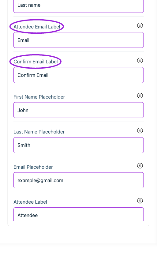
All Settings → Text — Checkout: Attendee information. Continued controls. The circles identify Attendee Email Label and Confirm Email Label.
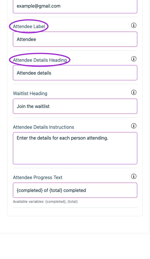
All Settings → Text — Checkout: Attendee information. Continued controls. The circles identify Attendee Label and Attendee Details Heading.
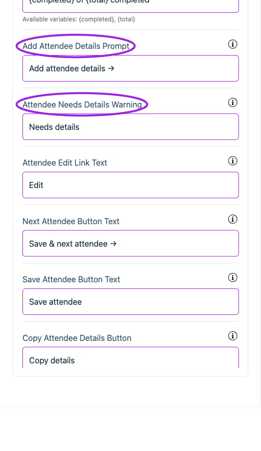
All Settings → Text — Checkout: Attendee information. Continued controls. The circles identify Add Attendee Details Prompt and Attendee Needs Details Warning.
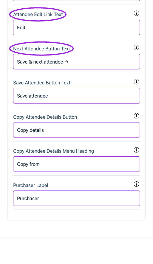
All Settings → Text — Checkout: Attendee information. Continued controls. The circles identify Attendee Edit Link Text and Next Attendee Button Text.
Checkout › Cart
View current controls
View current controls
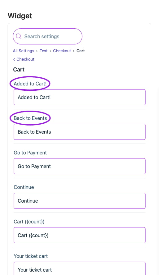
All Settings → Cart — Checkout: Cart. The circles identify Added to Cart! and Back to Events.
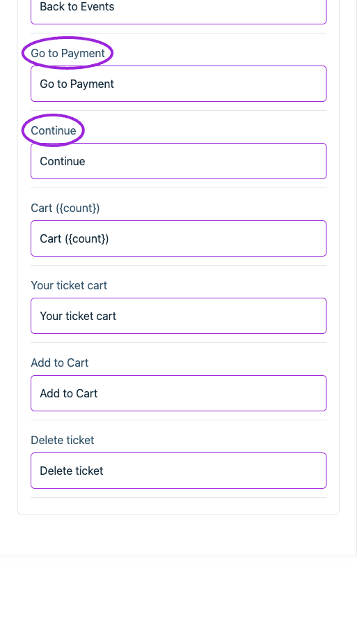
All Settings → Cart — Checkout: Cart. Continued controls. The circles identify Go to Payment and Continue.
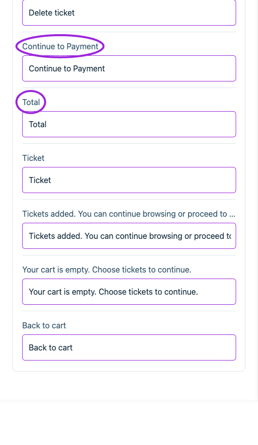
All Settings → Cart — Checkout: Cart. Continued controls. The circles identify Continue to Payment and Total.
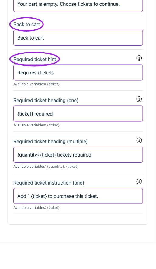
All Settings → Cart — Checkout: Cart. Continued controls. The circles identify Back to cart and Required ticket hint.
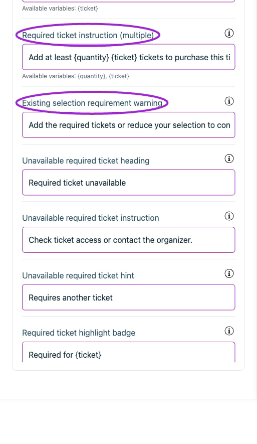
All Settings → Cart — Checkout: Cart. Continued controls. The circles identify Required ticket instruction (multiple) and Existing selection requirement warning.
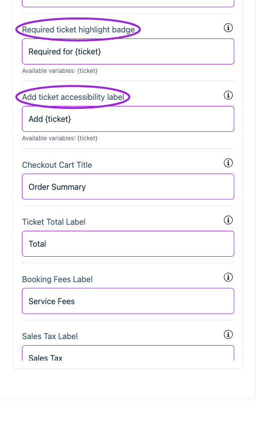
All Settings → Cart — Checkout: Cart. Continued controls. The circles identify Required ticket highlight badge and Add ticket accessibility label.
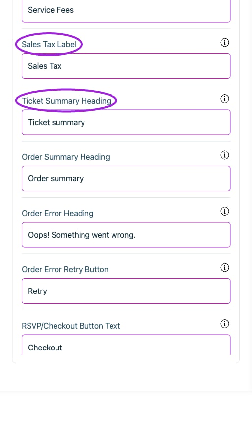
All Settings → Cart — Checkout: Cart. Continued controls. The circles identify Sales Tax Label and Ticket Summary Heading.
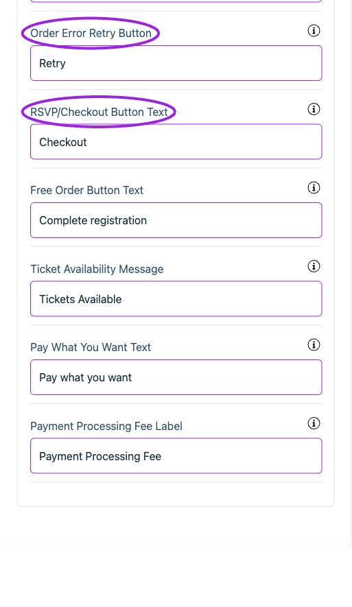
All Settings → Cart — Checkout: Cart. Continued controls. The circles identify Order Error Retry Button and RSVP/Checkout Button Text.
Checkout › Date & time selection
View current controls
View current controls
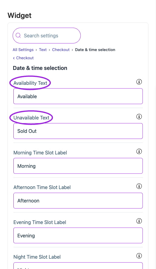
All Settings → Text — Checkout: Date & time selection. The circles identify Availability Text and Unavailable Text.
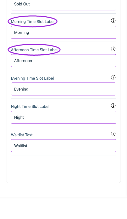
All Settings → Text — Checkout: Date & time selection. Continued controls. The circles identify Morning Time Slot Label and Afternoon Time Slot Label.
Checkout › Fast checkout
View current controls
View current controls
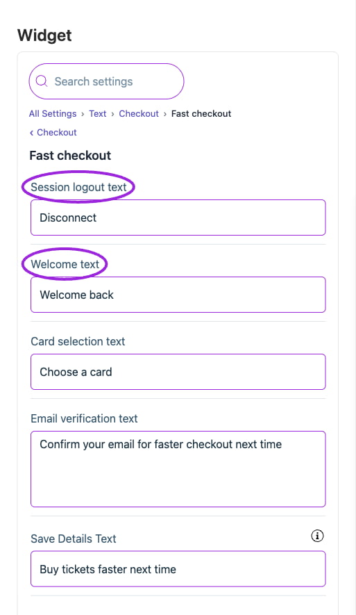
All Settings → Text — Checkout: Fast checkout. The circles identify Session logout text and Welcome text.
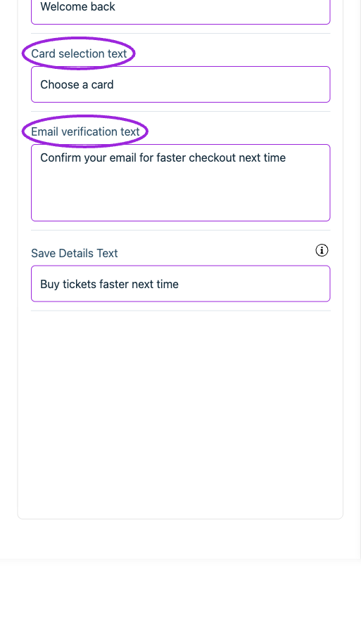
All Settings → Text — Checkout: Fast checkout. Continued controls. The circles identify Card selection text and Email verification text.
Checkout › General
View current controls
View current controls
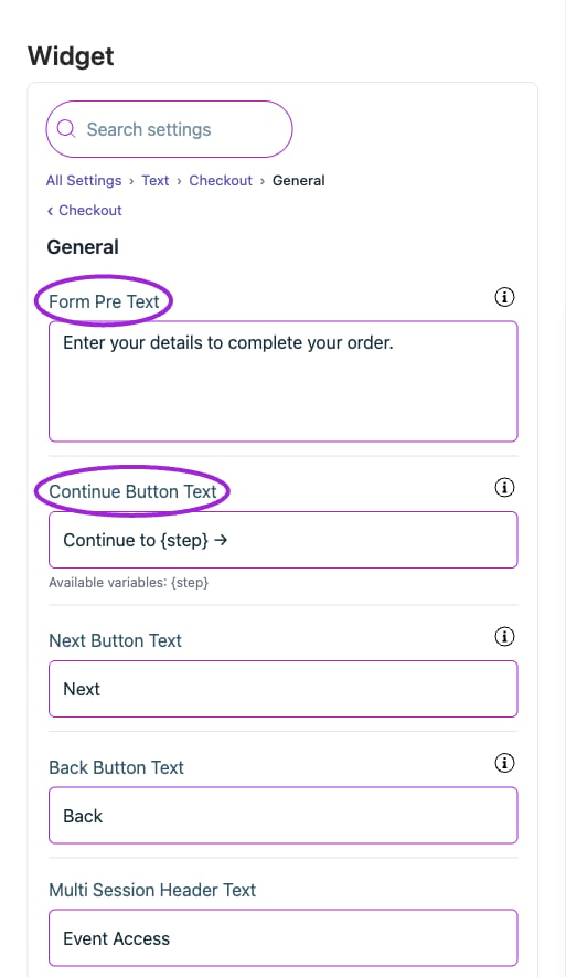
All Settings → Text — Checkout: General. The circles identify Form Pre Text and Continue Button Text.
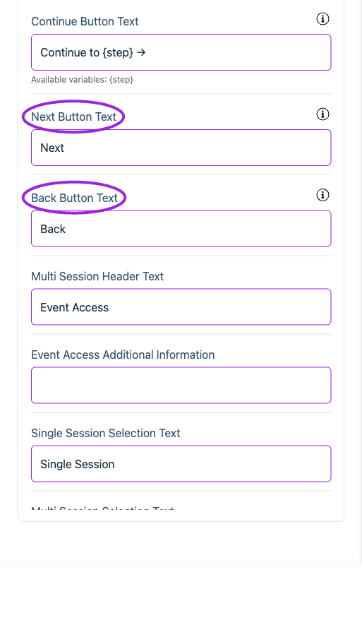
All Settings → Text — Checkout: General. Continued controls. The circles identify Next Button Text and Back Button Text.
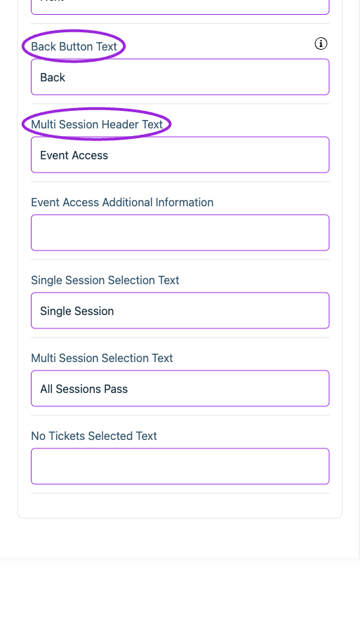
All Settings → Text — Checkout: General. Continued controls. The circles identify Back Button Text and Multi Session Header Text.
Checkout › Memberships
View current controls
View current controls
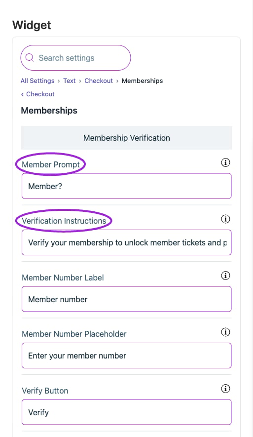
All Settings → Memberships — Checkout: Memberships. The circles identify Member Prompt and Verification Instructions.
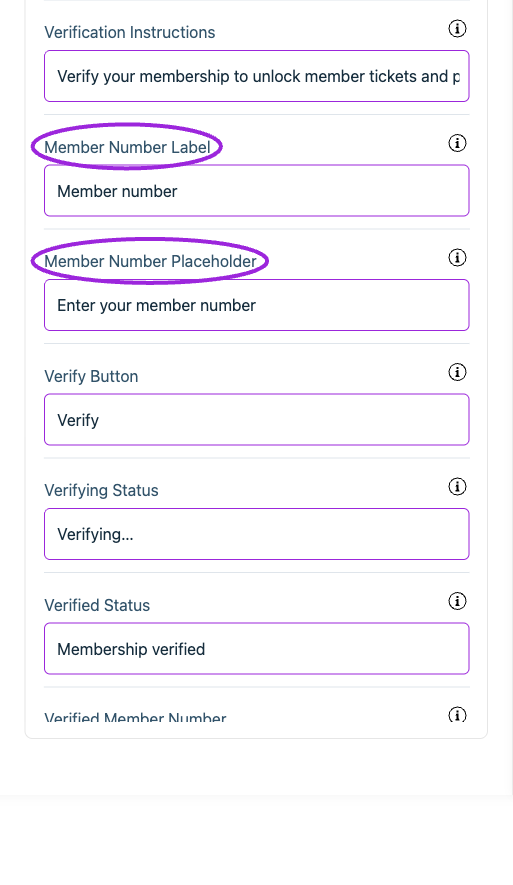
All Settings → Memberships — Checkout: Memberships. Continued controls. The circles identify Member Number Label and Member Number Placeholder.
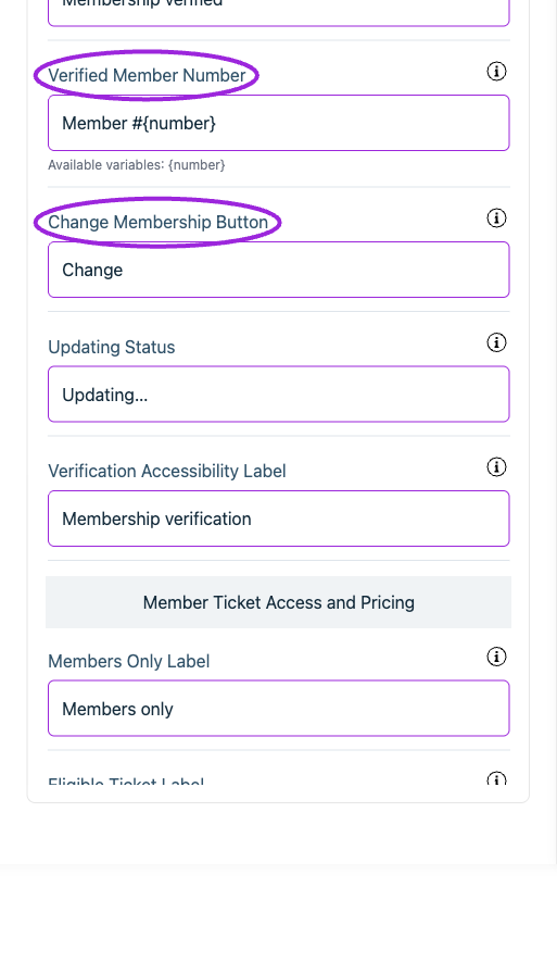
All Settings → Memberships — Checkout: Memberships. Continued controls. The circles identify Verified Member Number and Change Membership Button.
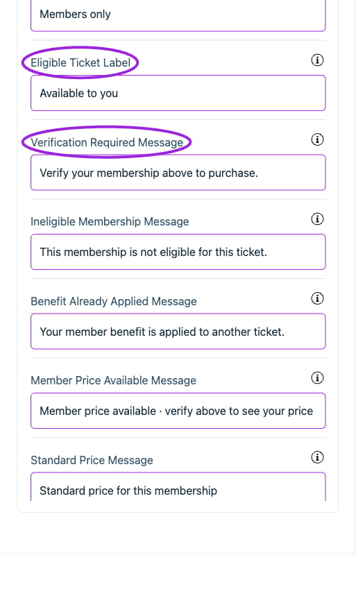
All Settings → Memberships — Checkout: Memberships. Continued controls. The circles identify Eligible Ticket Label and Verification Required Message.
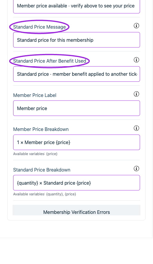
All Settings → Memberships — Checkout: Memberships. Continued controls. The circles identify Standard Price Message and Standard Price After Benefit Used.
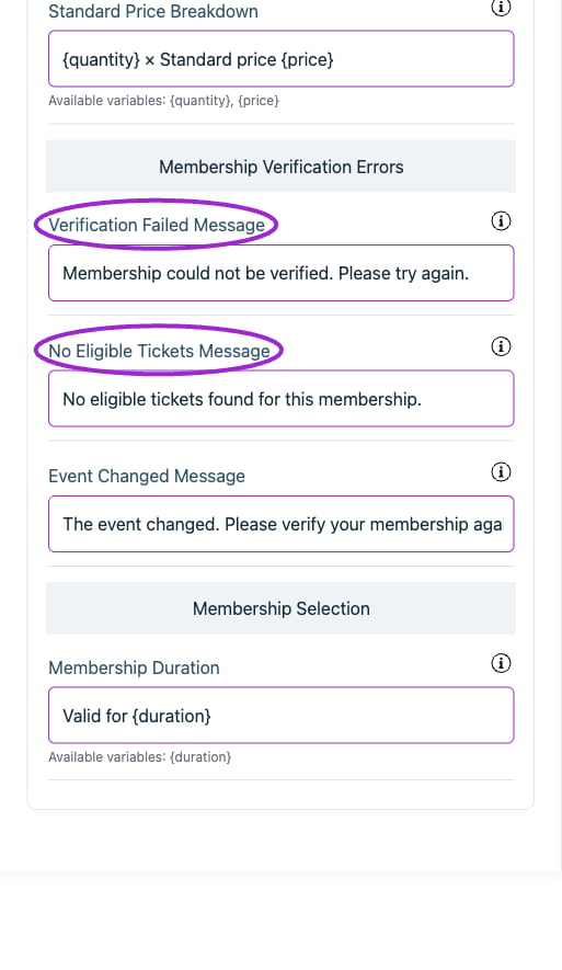
All Settings → Memberships — Checkout: Memberships. Continued controls. The circles identify Verification Failed Message and No Eligible Tickets Message.
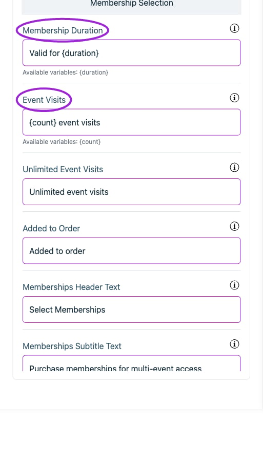
All Settings → Memberships — Checkout: Memberships. Continued controls. The circles identify Membership Duration and Event Visits.
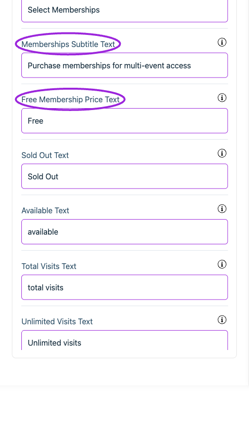
All Settings → Memberships — Checkout: Memberships. Continued controls. The circles identify Memberships Subtitle Text and Free Membership Price Text.
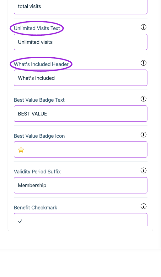
All Settings → Memberships — Checkout: Memberships. Continued controls. The circles identify Unlimited Visits Text and What's Included Header.
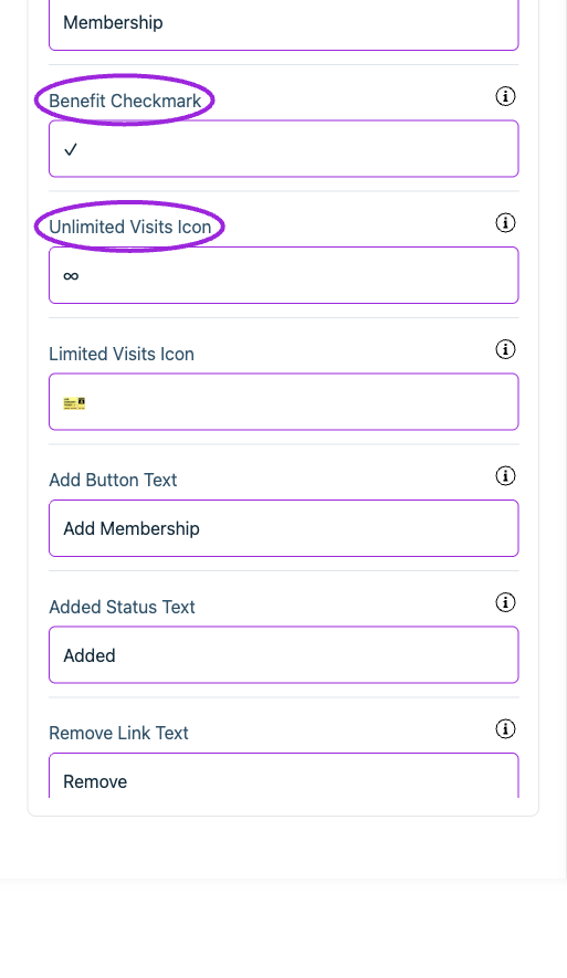
All Settings → Memberships — Checkout: Memberships. Continued controls. The circles identify Benefit Checkmark and Unlimited Visits Icon.
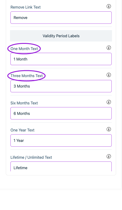
All Settings → Memberships — Checkout: Memberships. Continued controls. The circles identify One Month Text and Three Months Text.
Checkout › Payment information
View current controls
View current controls
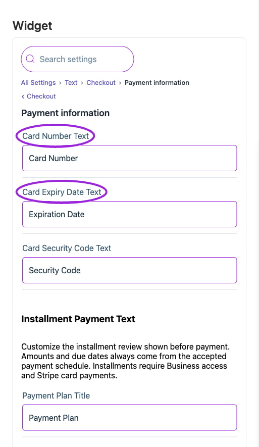
All Settings → Text — Checkout: Payment information. The circles identify Card Number Text and Card Expiry Date Text.
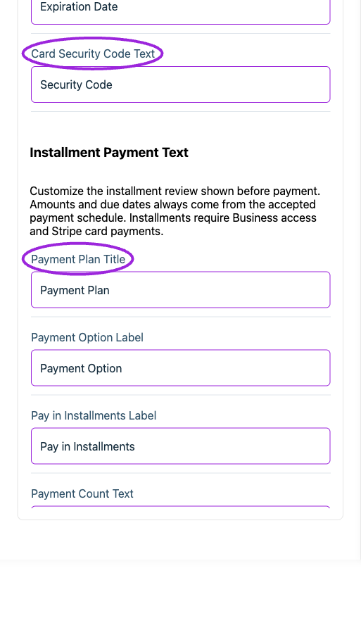
All Settings → Text — Checkout: Payment information. Continued controls. The circles identify Card Security Code Text and Payment Plan Title.
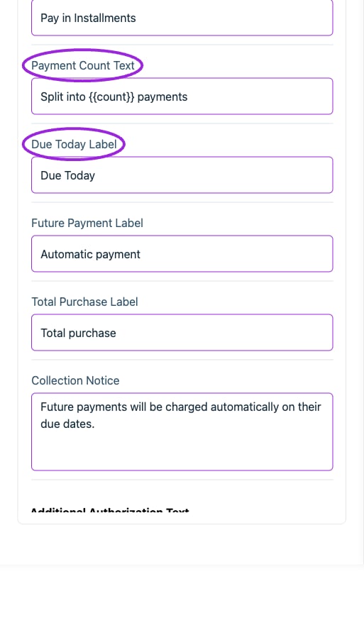
All Settings → Text — Checkout: Payment information. Continued controls. The circles identify Payment Count Text and Due Today Label.
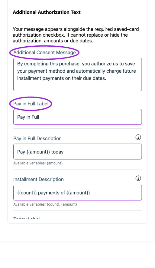
All Settings → Text — Checkout: Payment information. Continued controls. The circles identify Additional Consent Message and Pay in Full Label.
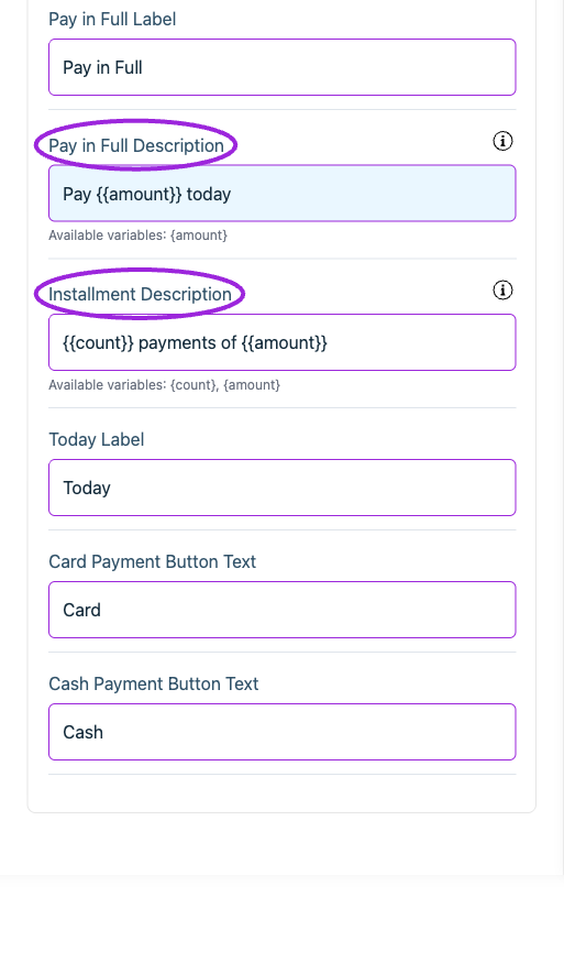
All Settings → Text — Checkout: Payment information. Continued controls. The circles identify Pay in Full Description and Installment Description.
Checkout › Promotional messages
View current controls
View current controls
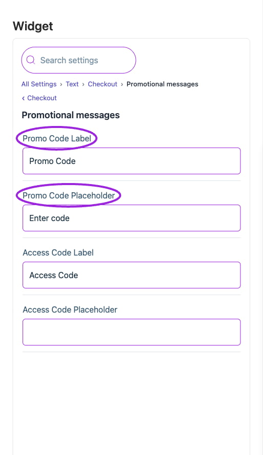
All Settings → Text — Checkout: Promotional messages. The circles identify Promo Code Label and Promo Code Placeholder.
Checkout › Seating
View current controls
View current controls
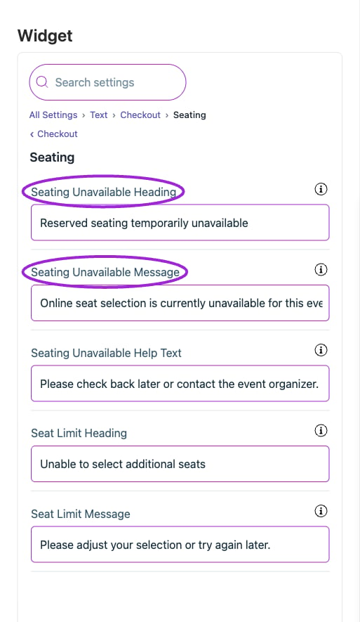
All Settings → Text — Checkout: Seating. The circles identify Seating Unavailable Heading and Seating Unavailable Message.
Checkout › Section labels
View current controls
View current controls
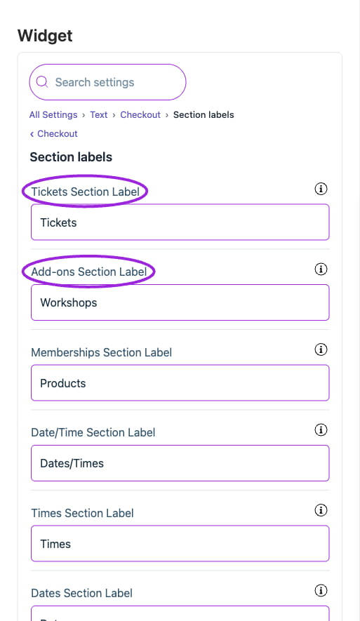
All Settings → Text — Checkout: Section labels. The circles identify Tickets Section Label and Add-ons Section Label.
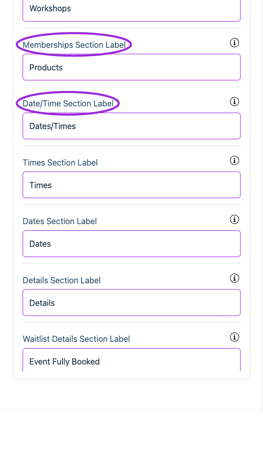
All Settings → Text — Checkout: Section labels. Continued controls. The circles identify Memberships Section Label and Date/Time Section Label.
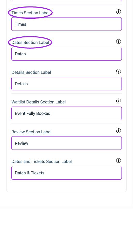
All Settings → Text — Checkout: Section labels. Continued controls. The circles identify Times Section Label and Dates Section Label.
Event details
View current controls
View current controls
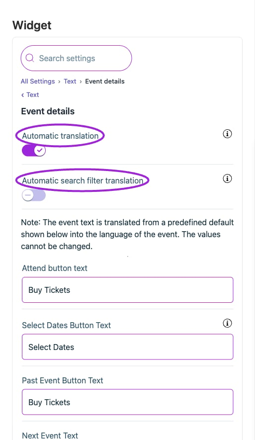
All Settings → Text — Event details. The circles identify Automatic translation and Automatic search filter translation.
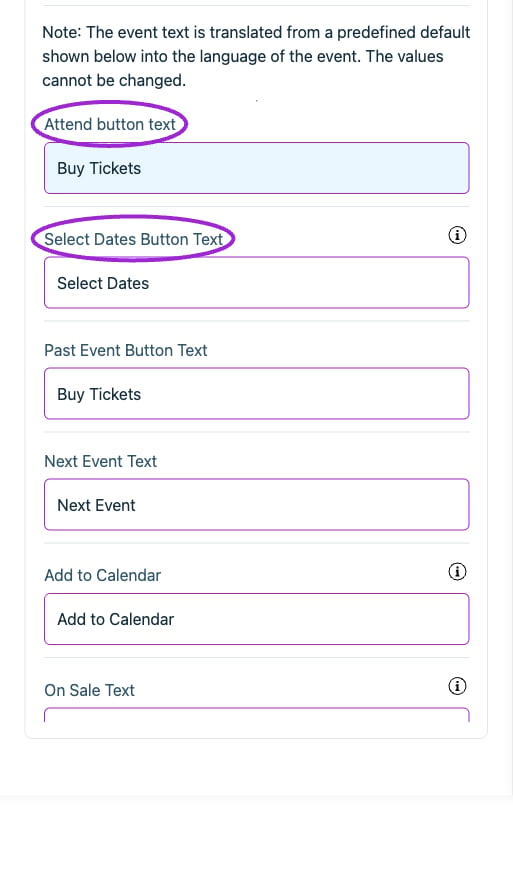
All Settings → Text — Event details. Continued controls. The circles identify Attend button text and Select Dates Button Text.
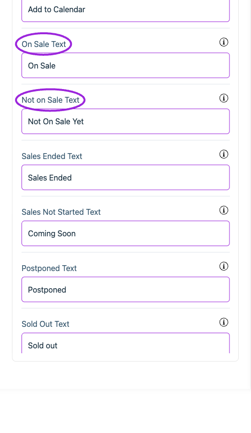
All Settings → Text — Event details. Continued controls. The circles identify On Sale Text and Not on Sale Text.
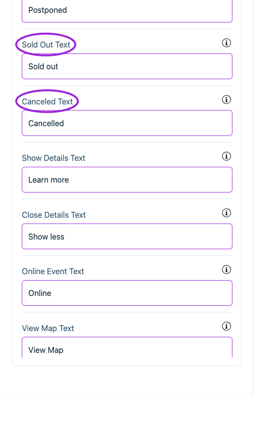
All Settings → Text — Event details. Continued controls. The circles identify Sold Out Text and Canceled Text.
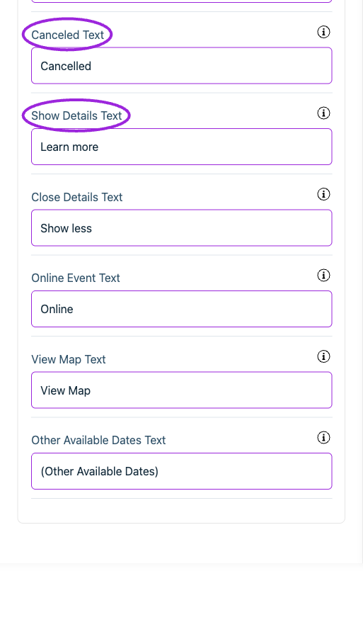
All Settings → Text — Event details. Continued controls. The circles identify Canceled Text and Show Details Text.
Search filters
View current controls
View current controls
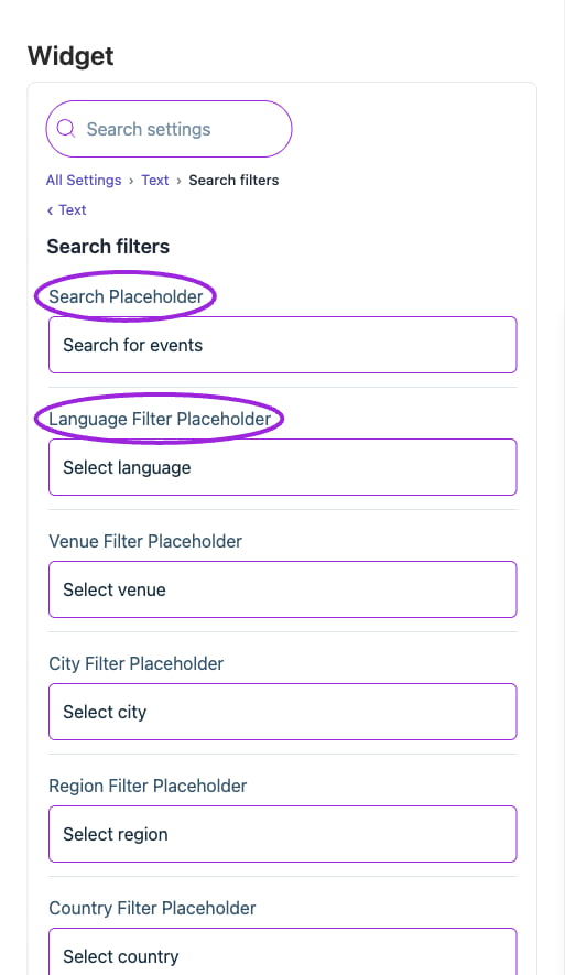
All Settings → Text — Search filters. The circles identify Search Placeholder and Language Filter Placeholder.
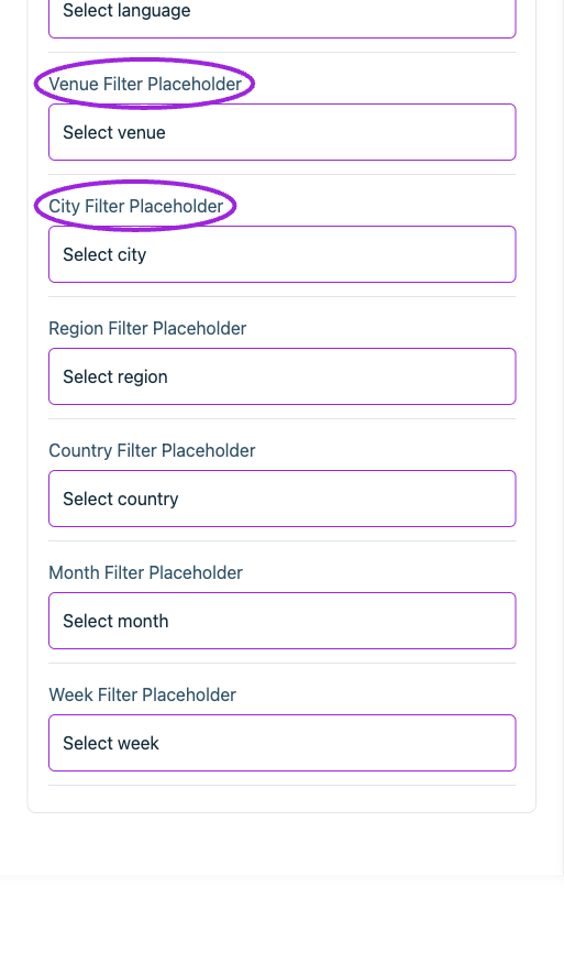
All Settings → Text — Search filters. Continued controls. The circles identify Venue Filter Placeholder and City Filter Placeholder.
Shopify product page
View current controls
View current controls
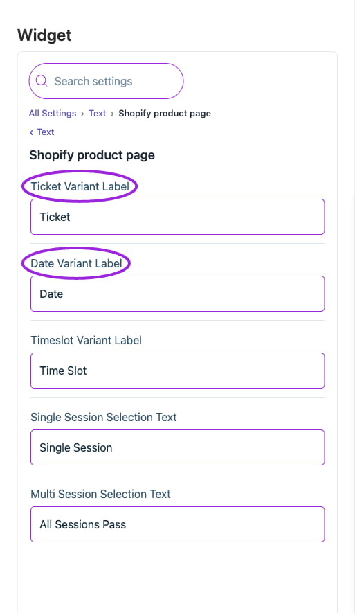
All Settings → Text — Shopify product page. The circles identify Ticket Variant Label and Date Variant Label.
Widget
View current controls
View current controls
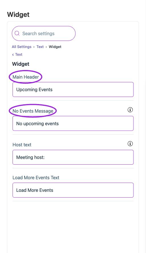
All Settings → Text — Widget. The circles identify Main Header and No Events Message.